A Fresh Future for Smith’s
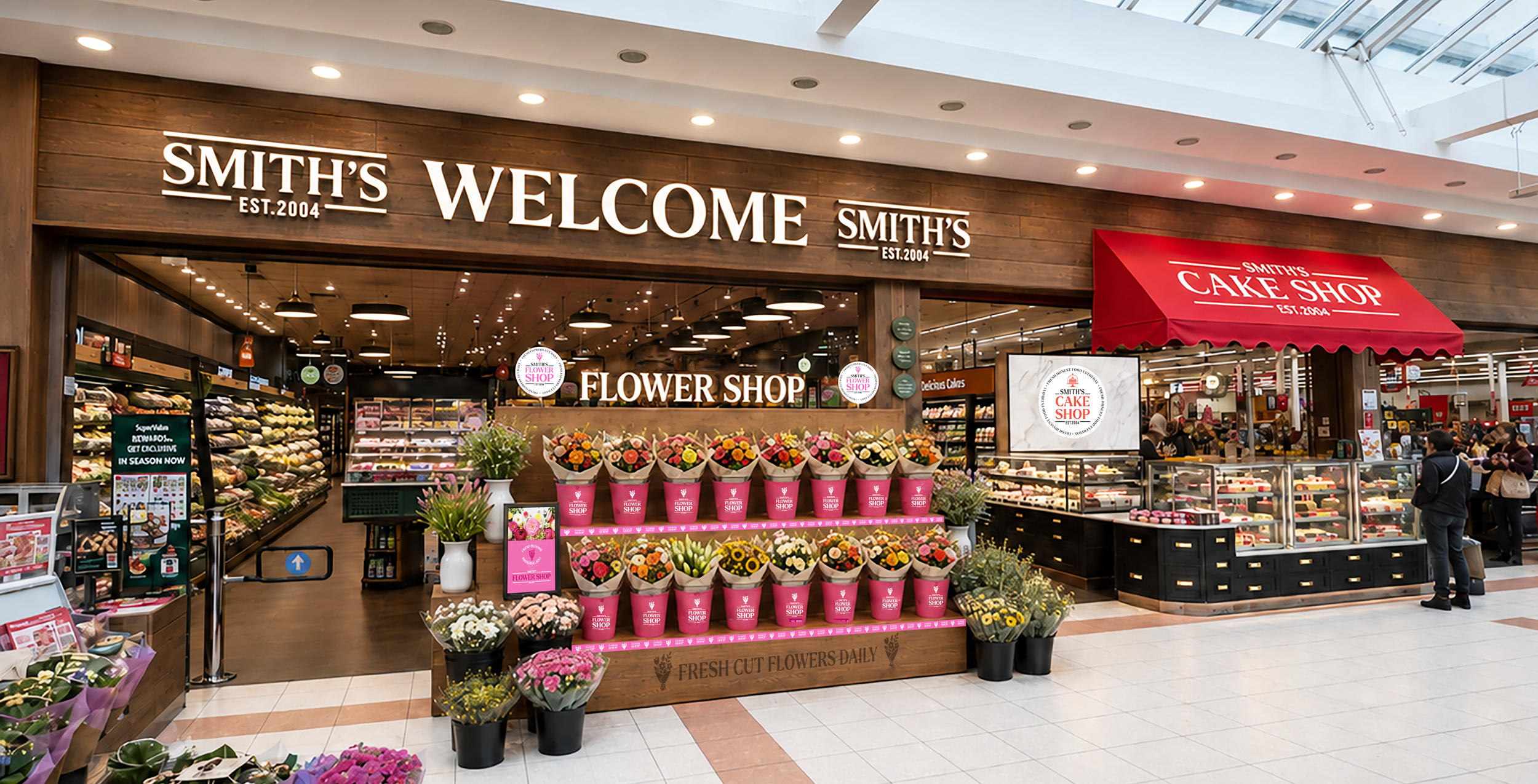
A fresh identity for Smith’s SuperValu in Navan, bringing its food, people and expertise into focus.
LMPP Studio created a complete retail brand for Smith’s Food Market, connecting department identities, packaging and in-store communication to make its fresh-food offer more distinctive and easier to shop.
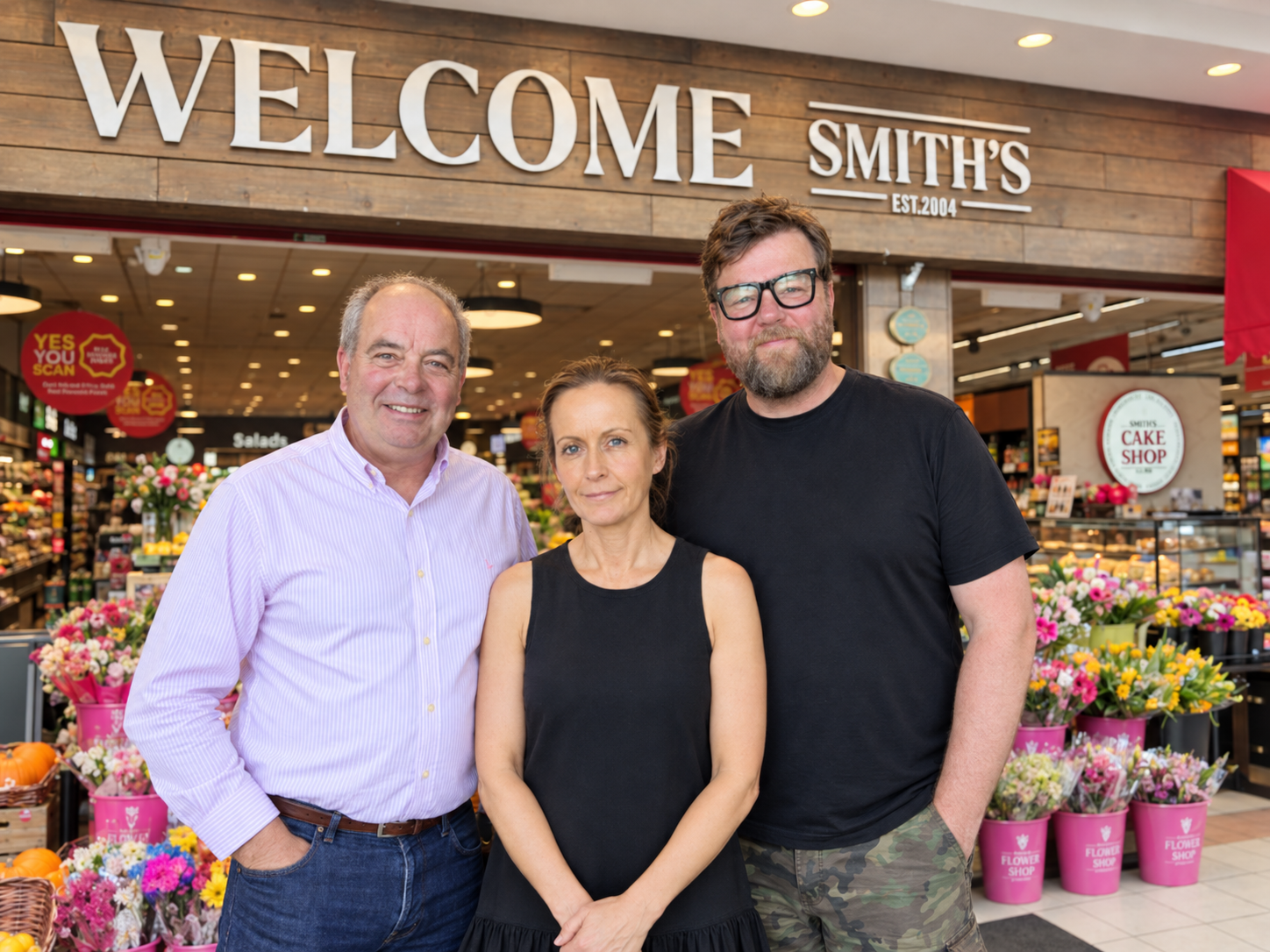
“LMPP understood what we wanted to achieve from the outset. The new identity, departments and packaging have completely transformed how Smith’s looks and feels, while still retaining what makes the store ours.”
Denis Smith, Managing Director

Project Overview / Our Brief
The brief was to give Smith’s a distinctive Food Market identity, making the quality and breadth of its fresh-food offer clearer to customers while retaining the character of the family-run store.
Working with the Smith family and management team, we developed the master identity and individual department brands, extending them across signage, wayfinding, packaging, product labels, uniforms and promotional POS. This included creating Fresh to Go as a new in-store department and giving the prepared-food ranges clear identities of their own.
We worked closely with printers and packaging suppliers to bring the designs into everyday use, from counter signage to individual meal labels. The result brings greater consistency across the store while giving each department its own personality.
Services
Brand Strategy | Visual Identity | Retail Environment Design | Store Planning | Department Branding | Illustration | Wayfinding & Signage | Packaging Design | Product Labels | Photography & Art Direction | POS & Campaign Roll-Out | Print & Production Liaison
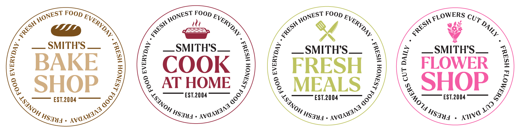
One Brand Across Every Touchpoint
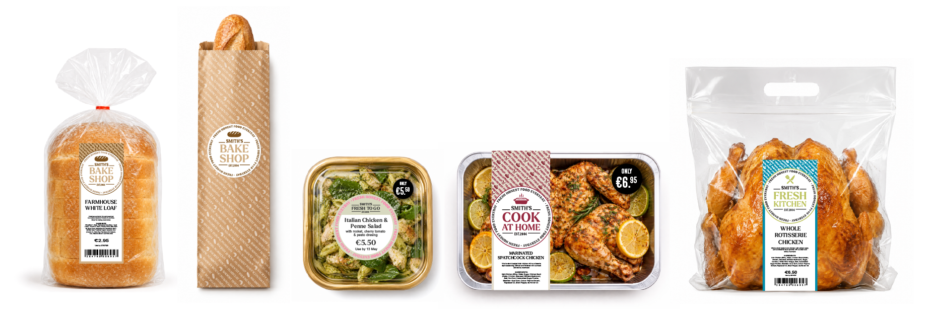
From freshly prepared meals and food-to-go to bakery, butchery and flowers, every department has been designed to feel individual while remaining unmistakably part of Smith’s.
Across packaging, labels, signage, POS and the wider in-store experience, a consistent visual language connects the entire fresh-food offer and gives Smith’s own brand a much stronger presence.

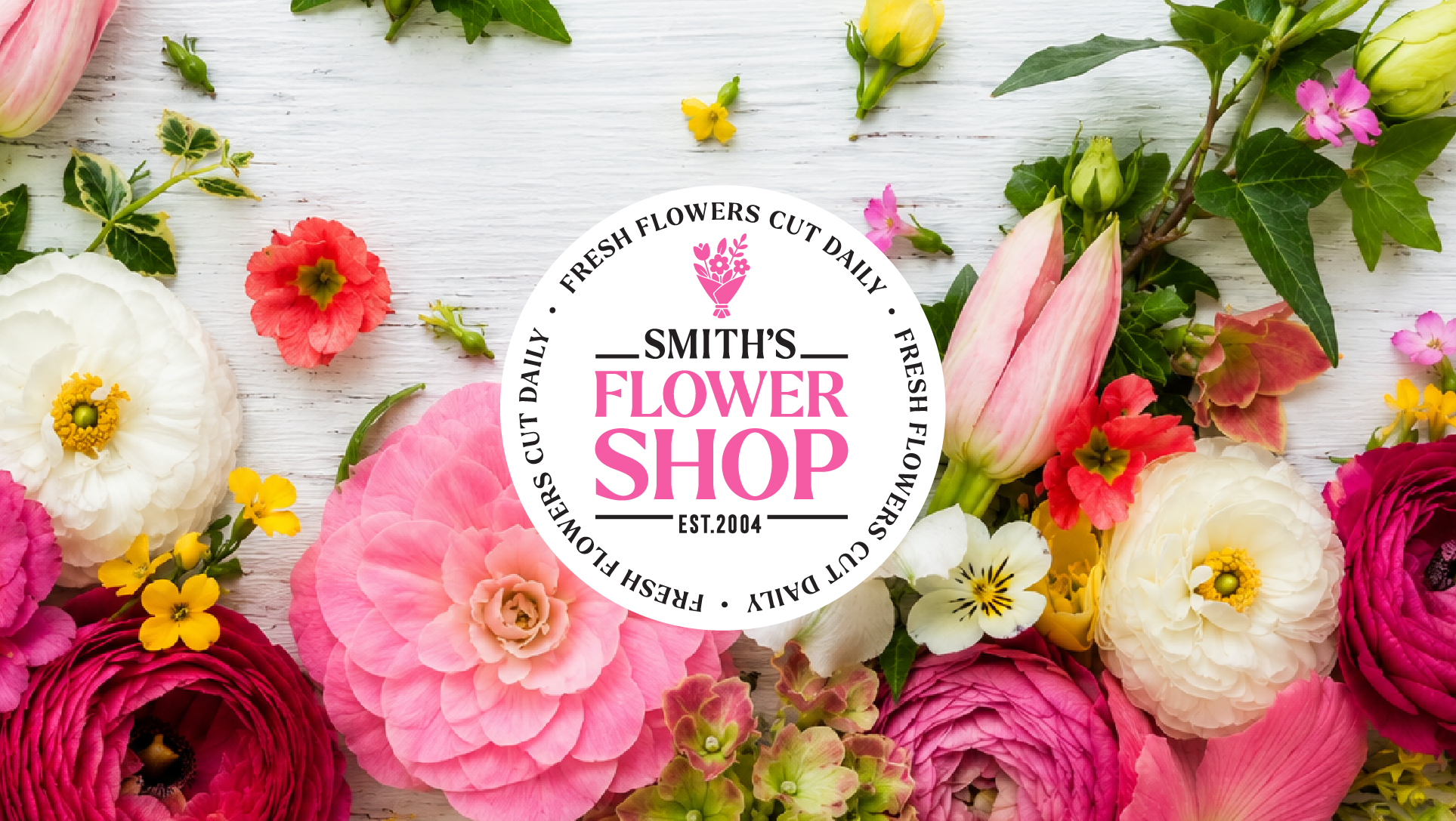
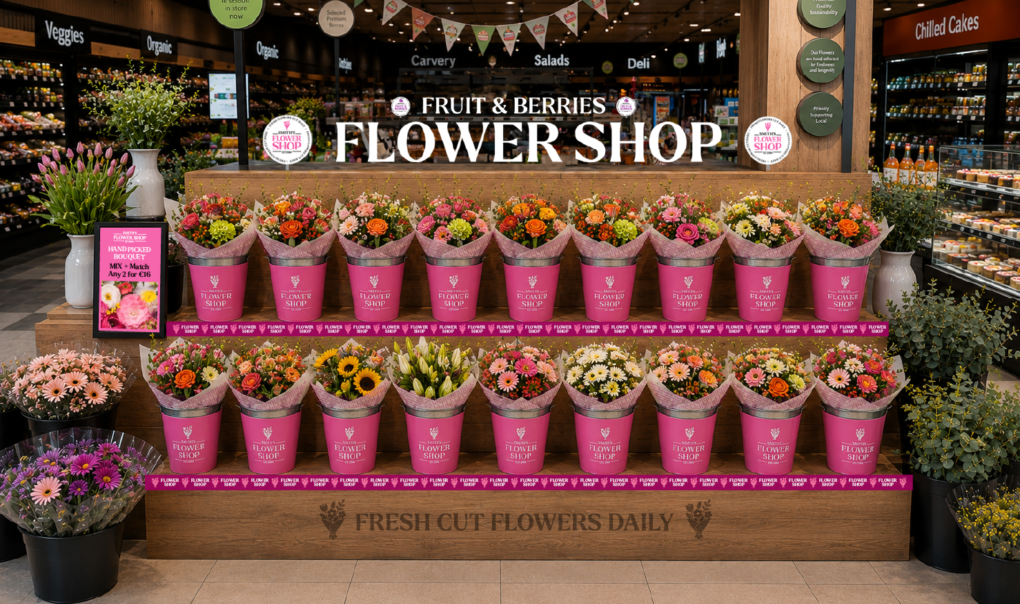
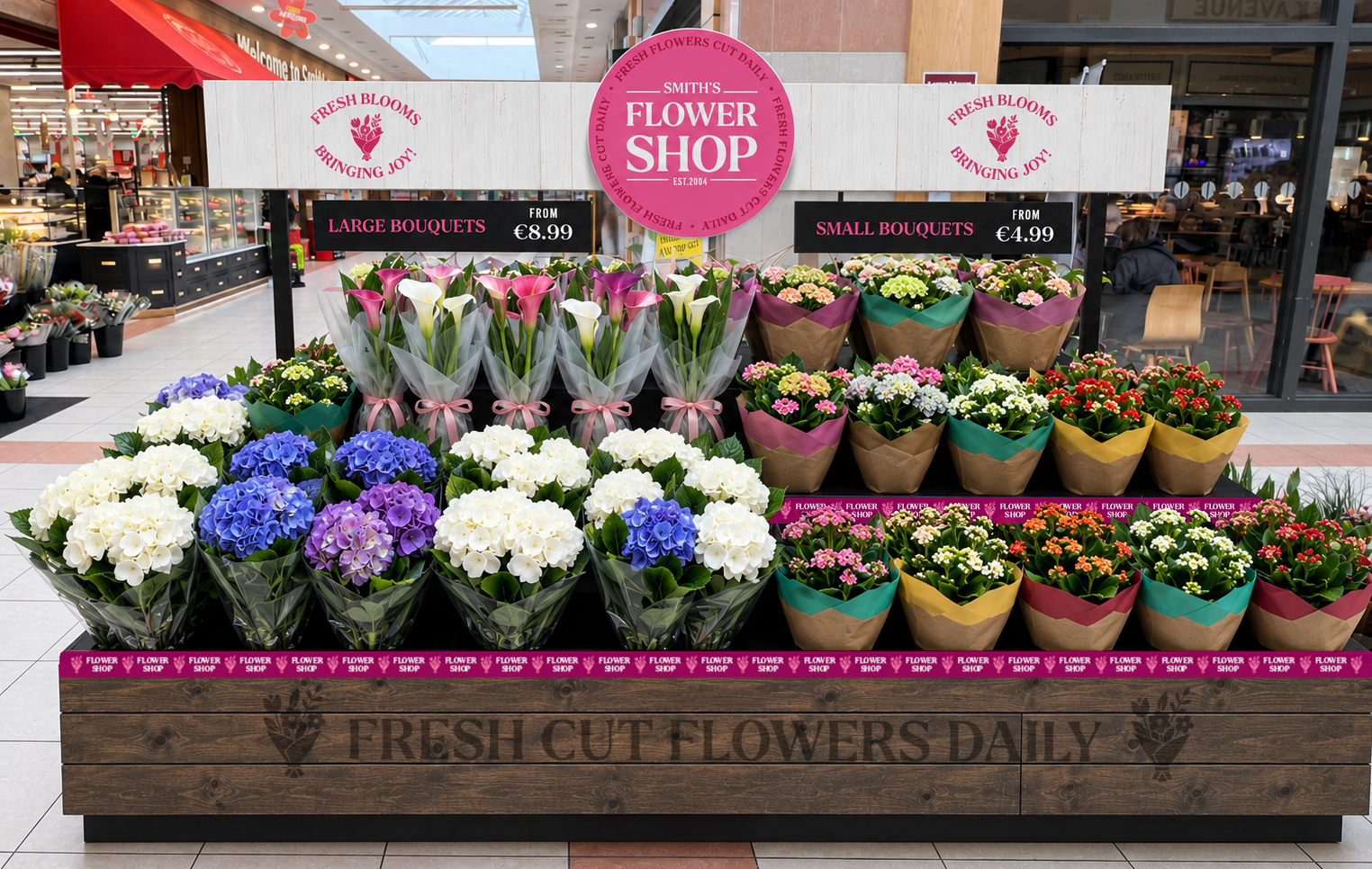
Built around the idea of fresh flowers cut daily, Smith’s Flower Shop was developed as a bold, uplifting department with a strong identity of its own, while still feeling unmistakably part of the wider Smith’s brand family.
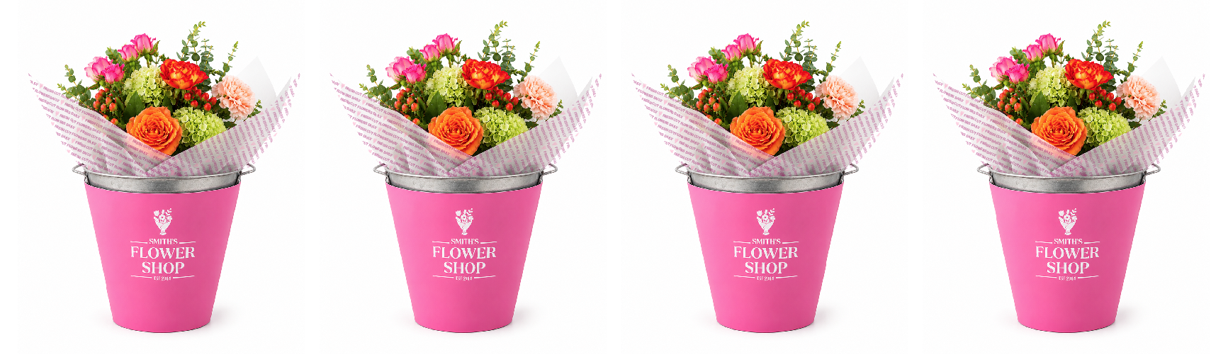
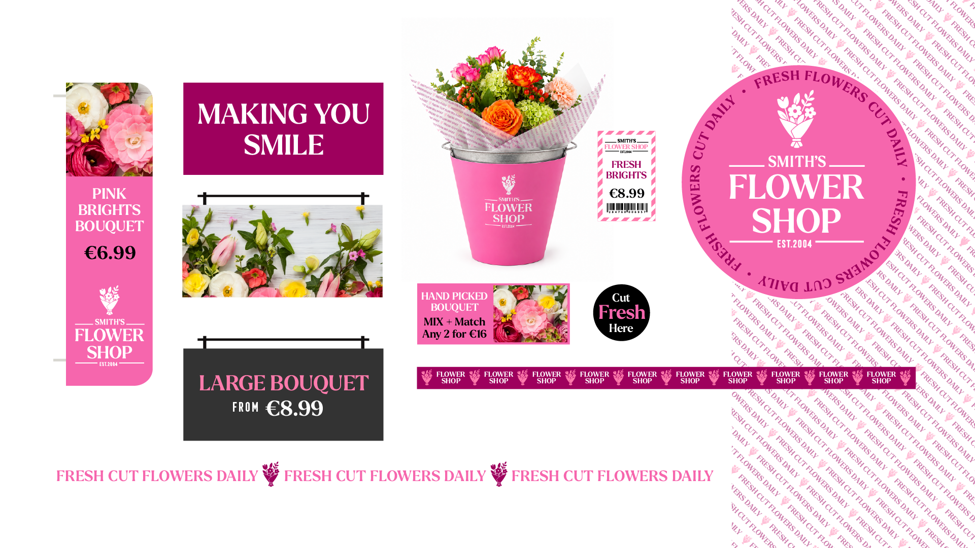
The visual language uses confident pink tones, expressive typography and simple, positive messaging to bring energy and personality to the department. From bouquet sleeves and product labels to promotional POS, department signage and shelf-edge communication, every element was designed to make the offer feel more considered, more giftable and easier to shop.
Messaging such as “Making You Smile”, “Fresh Brights” and “Hand Picked Bouquet” adds warmth and character, while the consistent use of the Flower Shop identity gives Smith’s a much stronger own-brand presence across the full floral offer.
The result is a department that feels fresh, joyful and distinctive, turning flowers from a functional supermarket category into a more memorable part of the overall Smith’s shopping experience.

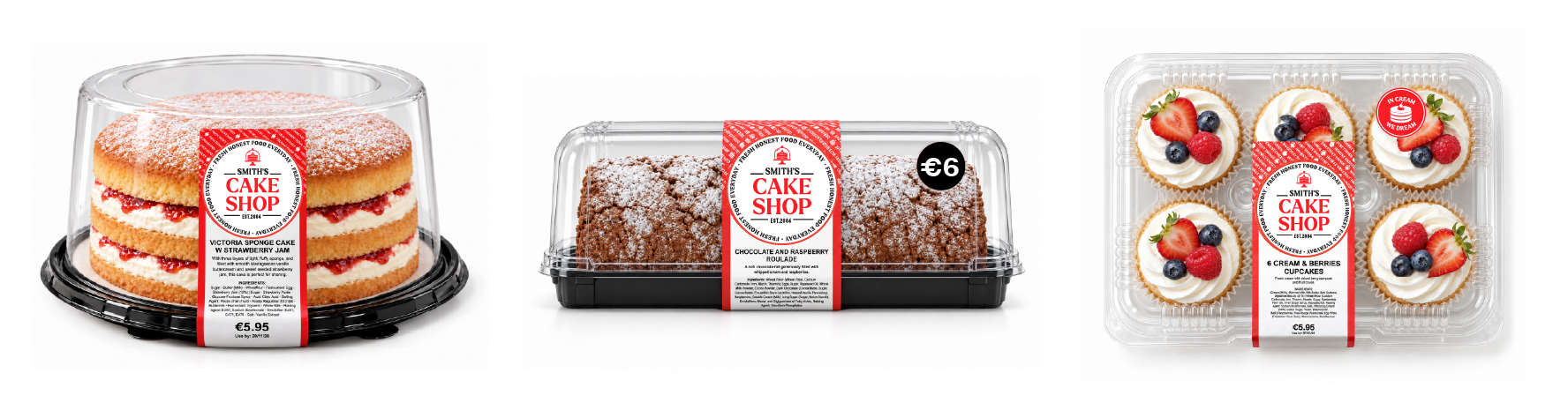
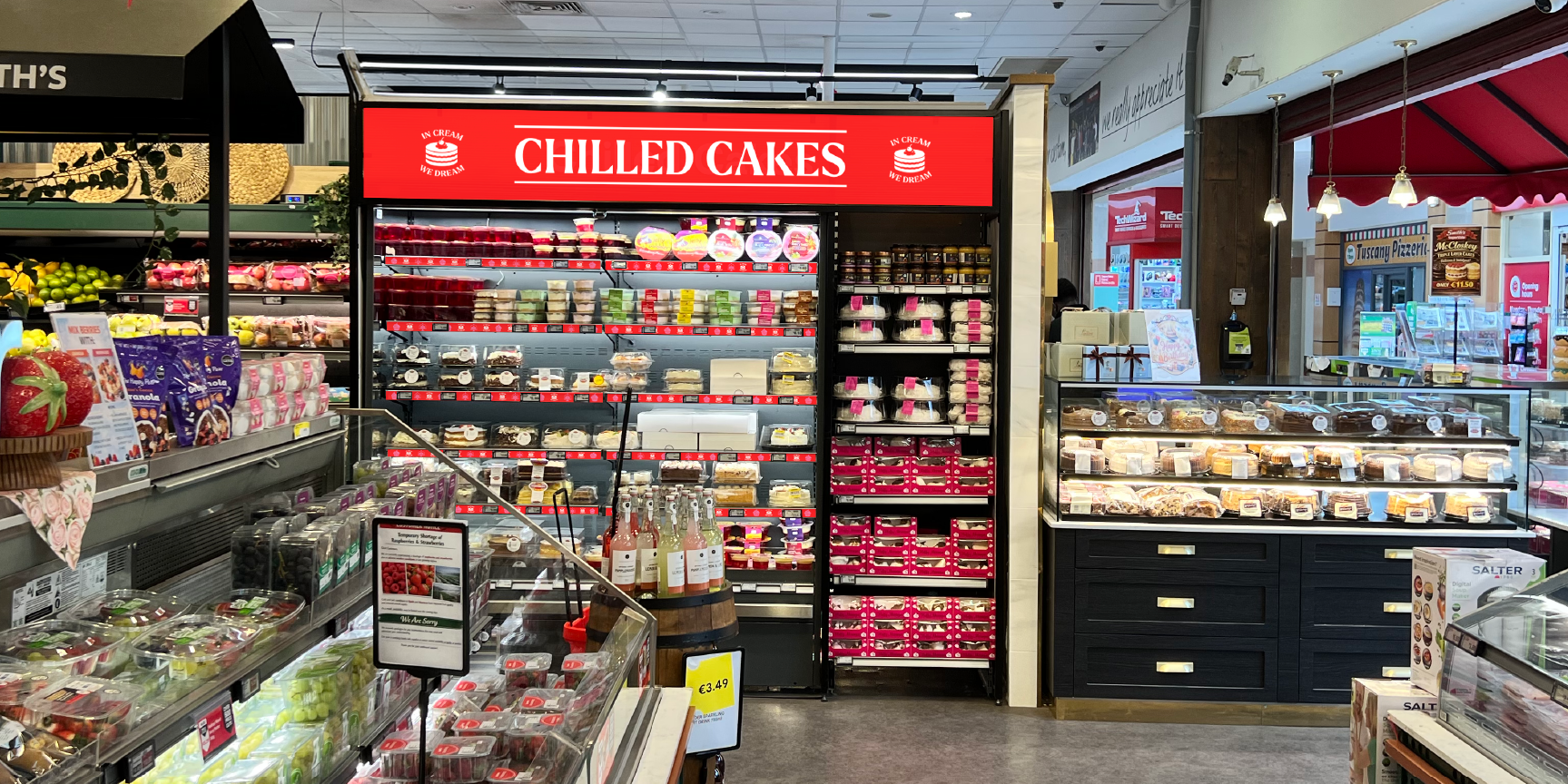
Smith’s Cake Shop was created to bring a brighter, more distinctive personality to the store’s sweet bakery offer, while still feeling clearly connected to the wider Smith’s brand system.
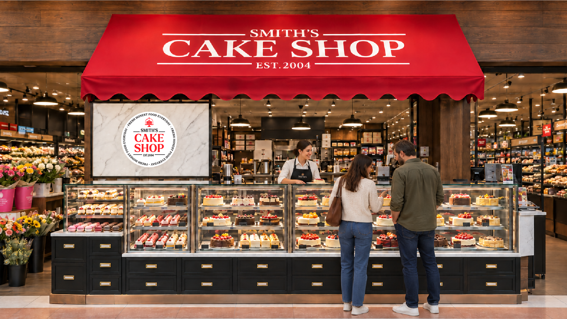
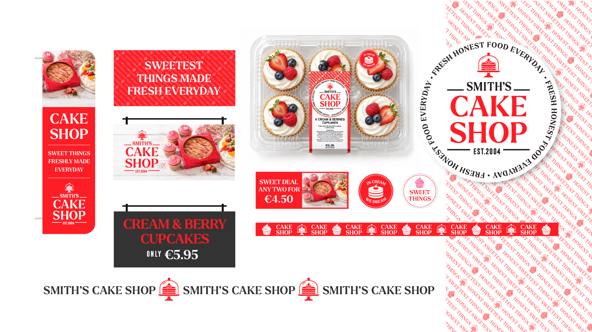
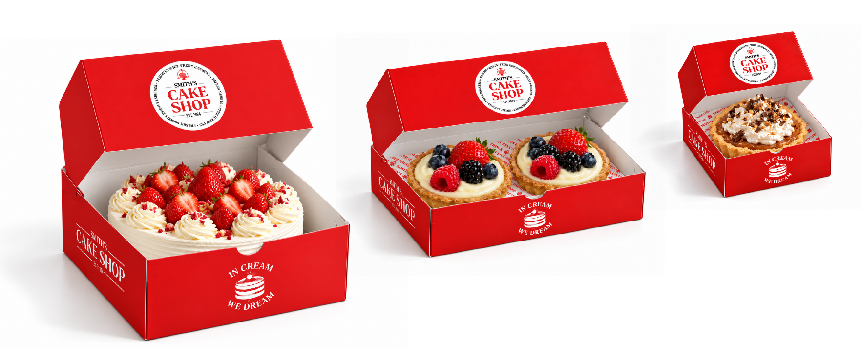
The identity uses a bold red and pink palette, expressive typography and playful messaging to give the department energy and shelf impact. The visual language was designed to work across everything from cupcake packs and sharing cakes to product sleeves, labels, signage and promotional POS, creating a consistent look across a wide range of formats.
Messaging such as “Sweetest Things Every Day” helps give the department its own tone of voice, while the circular Cake Shop marque acts as a strong recognisable device across packaging and in-store communication.


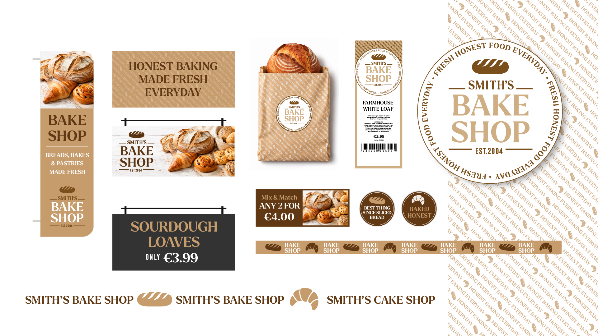
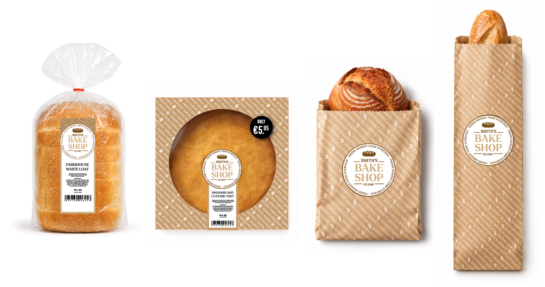
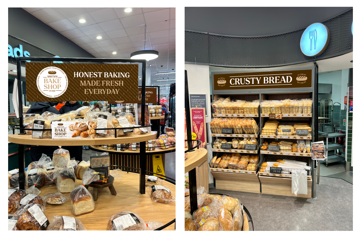
Built around the idea of fresh, honest baking every day, Smith’s Bake Shop was developed as a warm, distinctive department with its own personality while still sitting clearly within the wider Smith’s brand system.
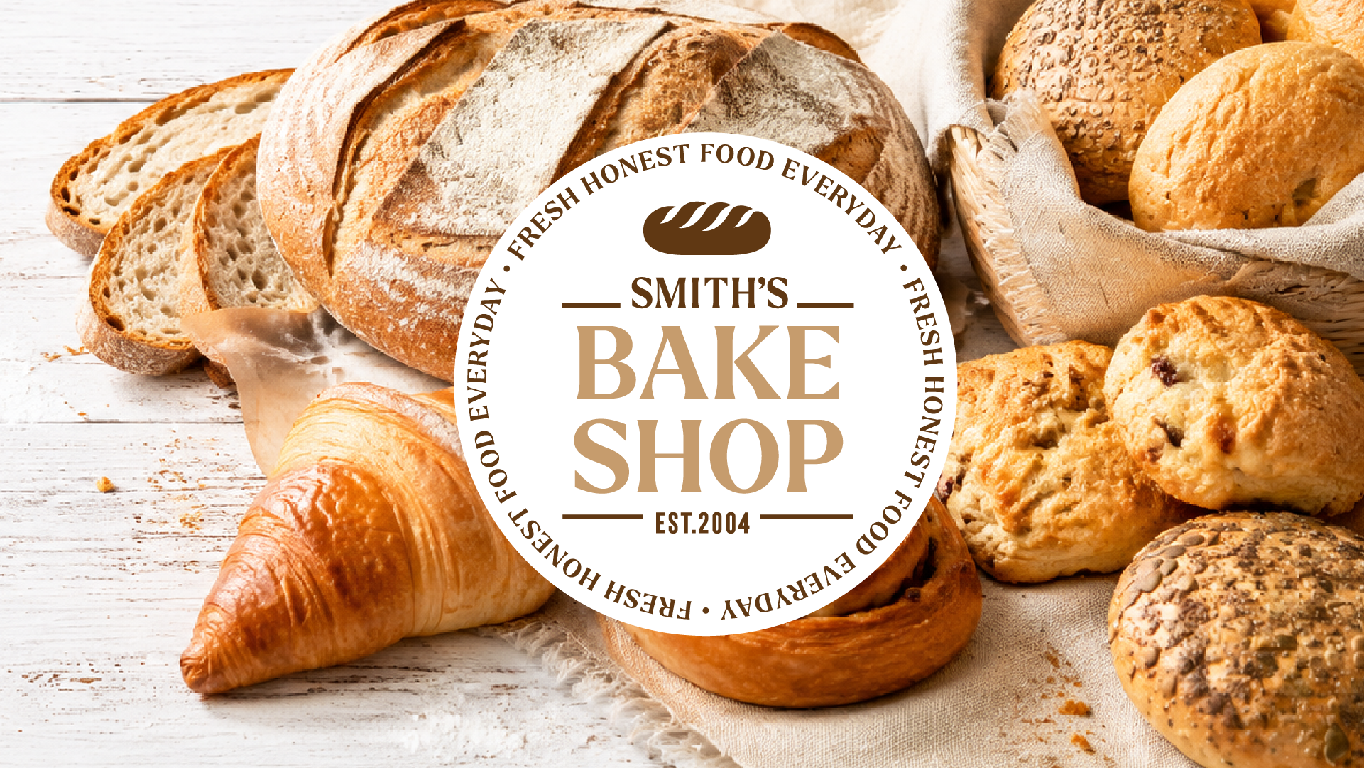

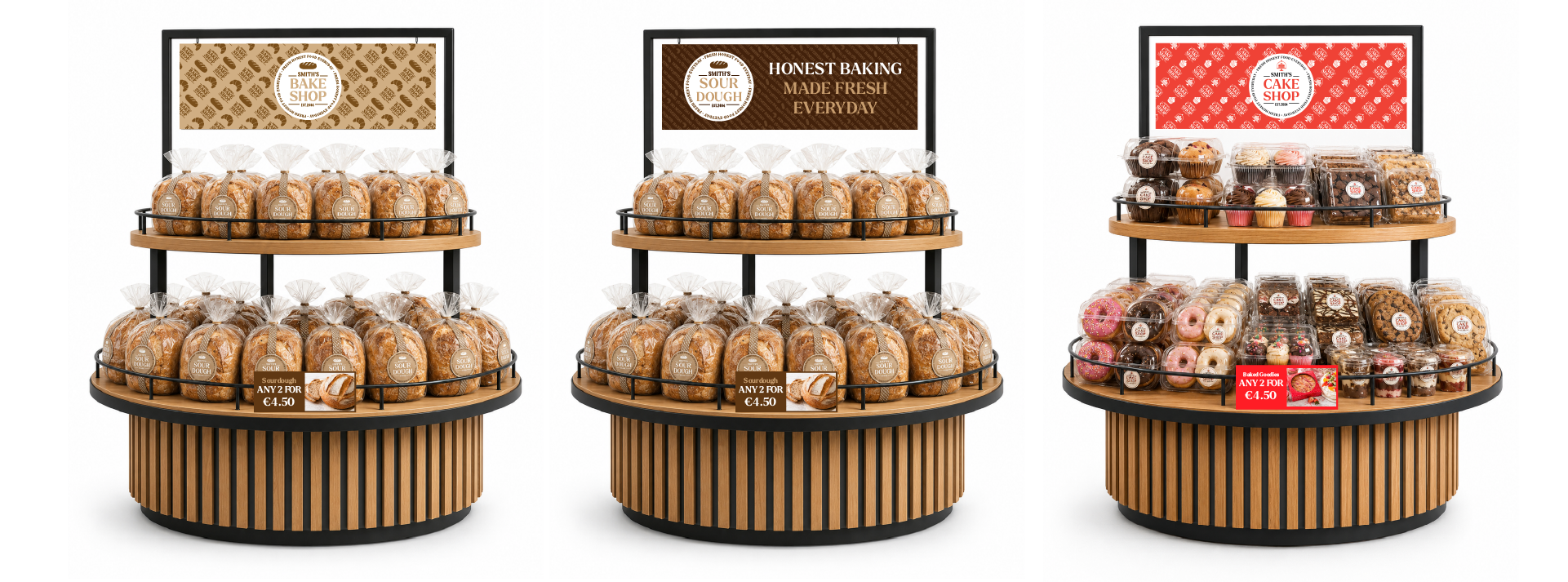
The identity combines traditional bakery cues with a more contemporary retail feel, using a crafted typographic style, warm natural tones and simple product-led messaging. This visual language was then carried across department signage, packaging, labels, promotional POS and shelf-edge communication to create a much stronger and more consistent presence in-store.
The result is a bakery offer that feels generous, familiar and handmade, while giving Smith’s a recognisable own-brand platform that can work across everything from freshly baked bread and pastries to packaged bakery products.

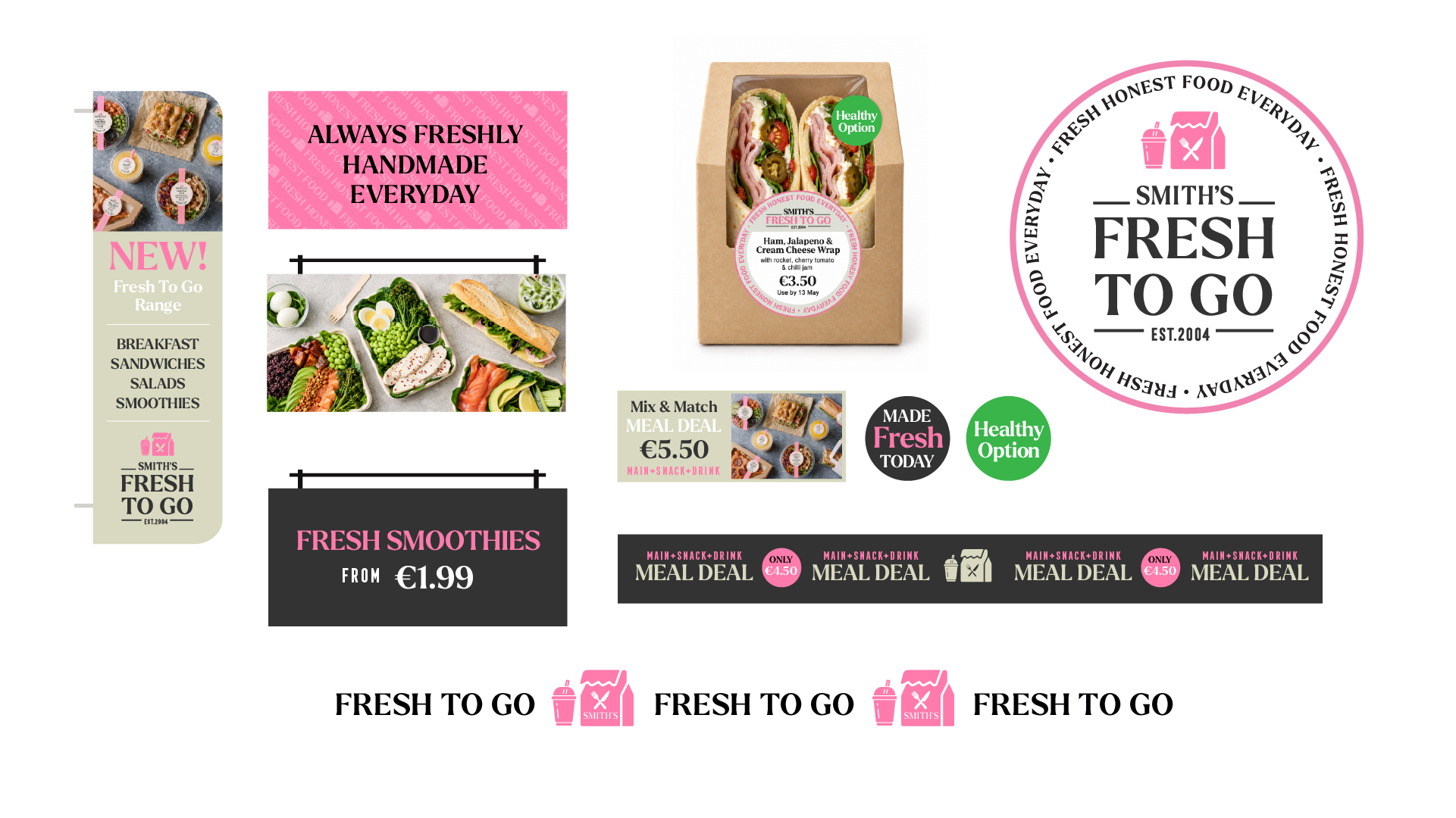
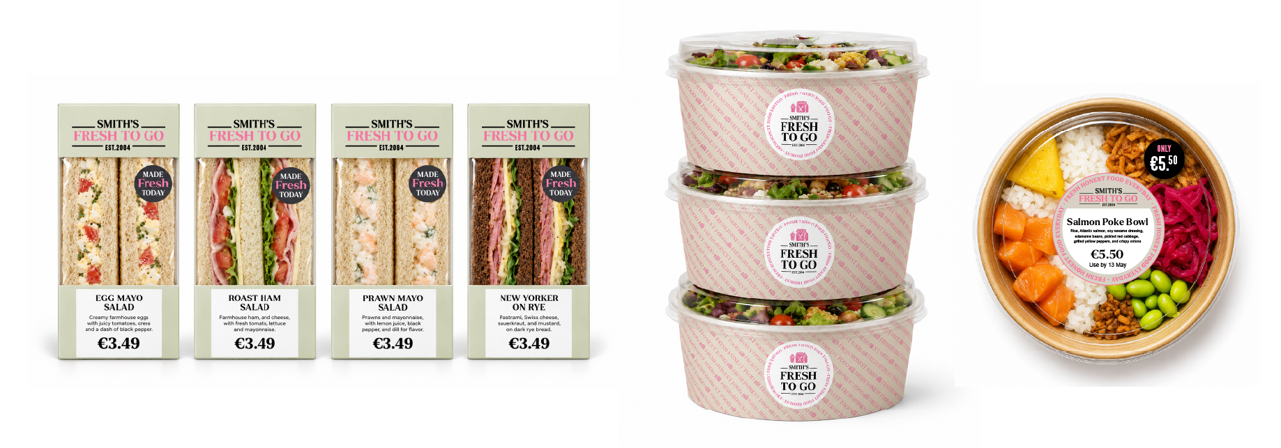
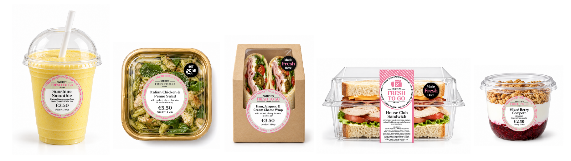
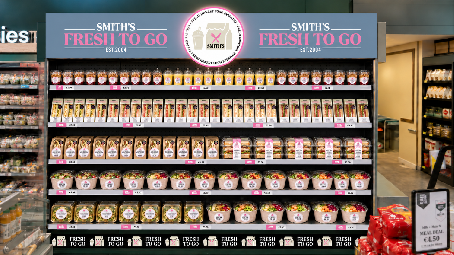
A new in-store department created for Smith’s, Fresh to Go brings sandwiches, wraps, salads and lighter bites together in one dedicated offer, designed around fresh food for busy days.
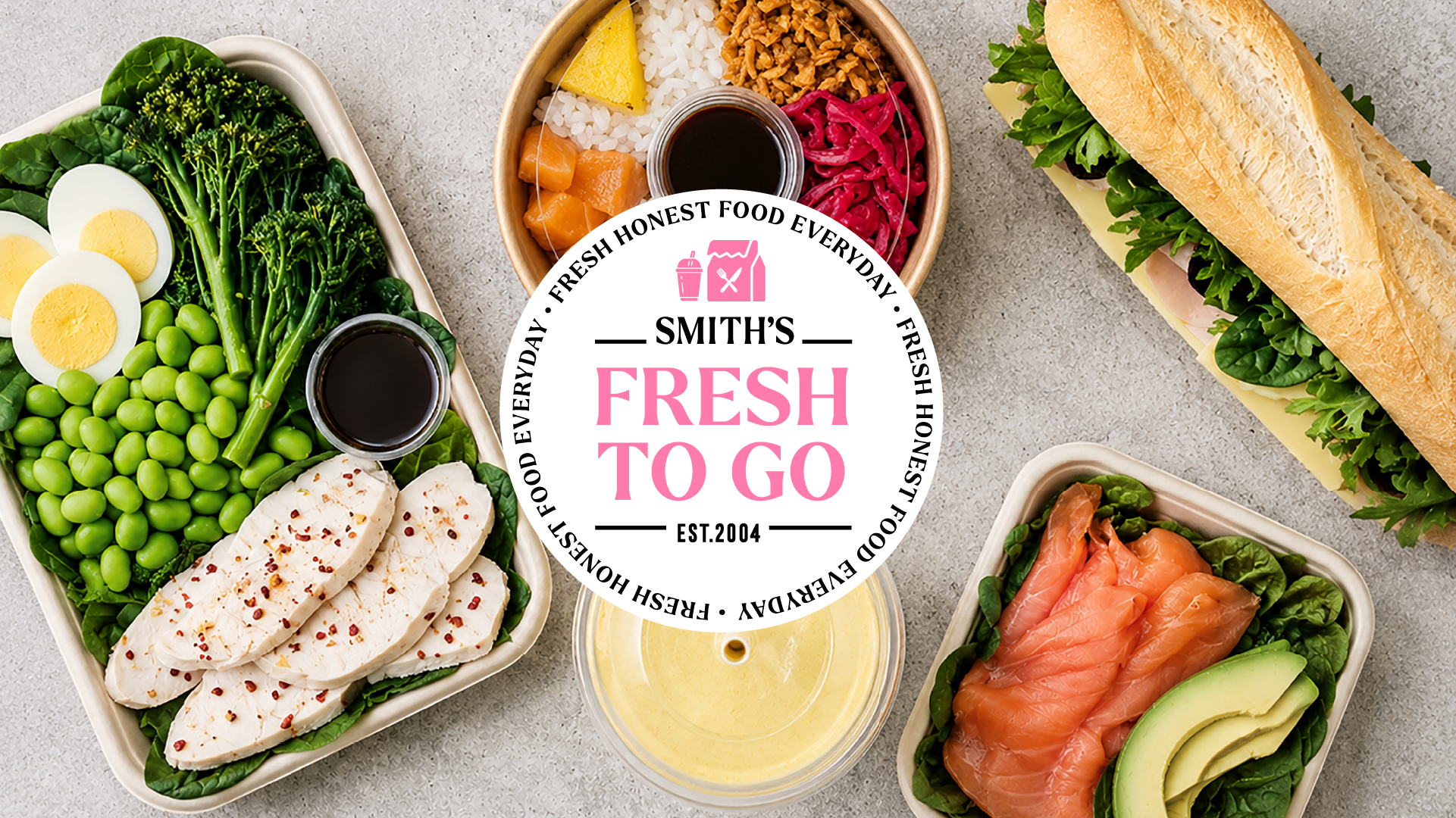
We developed the department’s identity across packaging, labels, signage and chilled displays, giving the new range a distinctive presence within the store. Clear product information and recognisable brand details make the offer easy to spot and shop, while keeping the food centre stage.


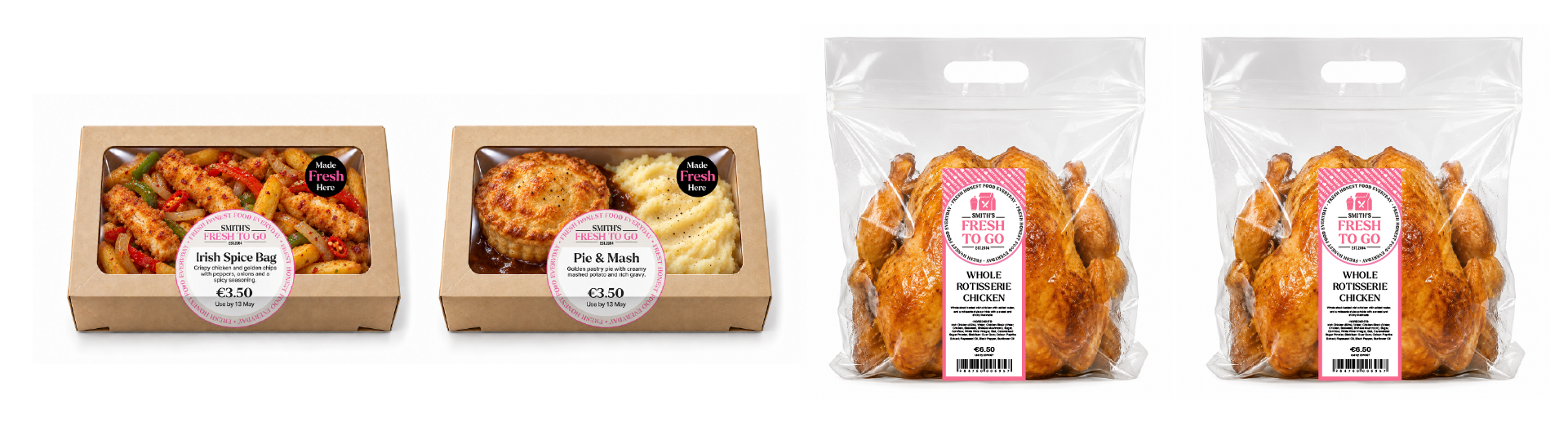
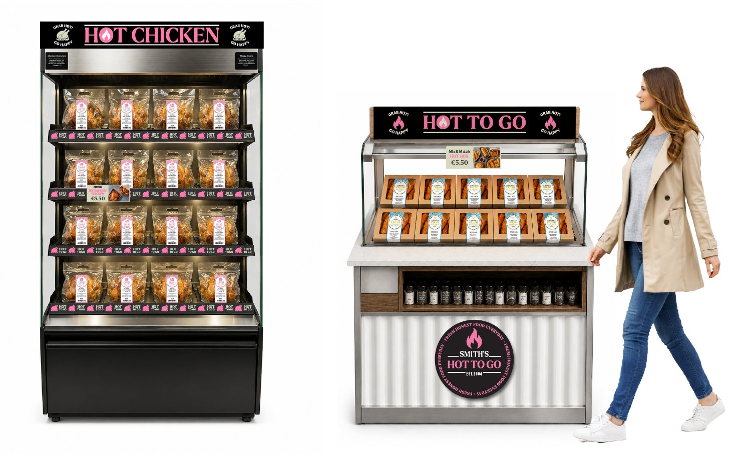
Smith’s Hot to Go gives the hot takeaway offer a bold, immediate presence, connecting the food on display with the packaging customers carry away.
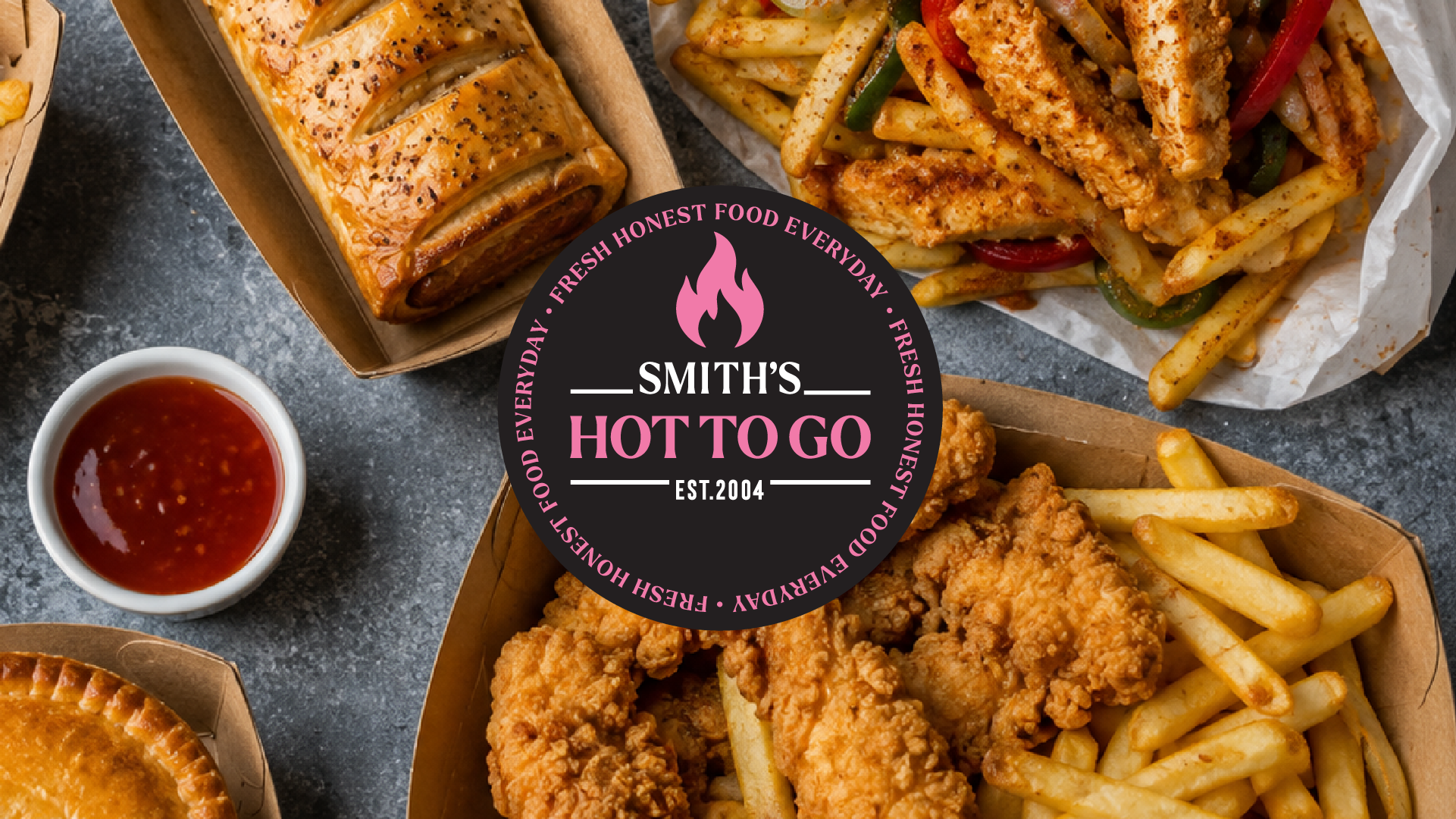

The dark grey and bright pink palette creates a recognisable identity across heated units, signage, bags and boxes. Together, these elements make the hot takeaway offer easy to spot, choose and carry away.

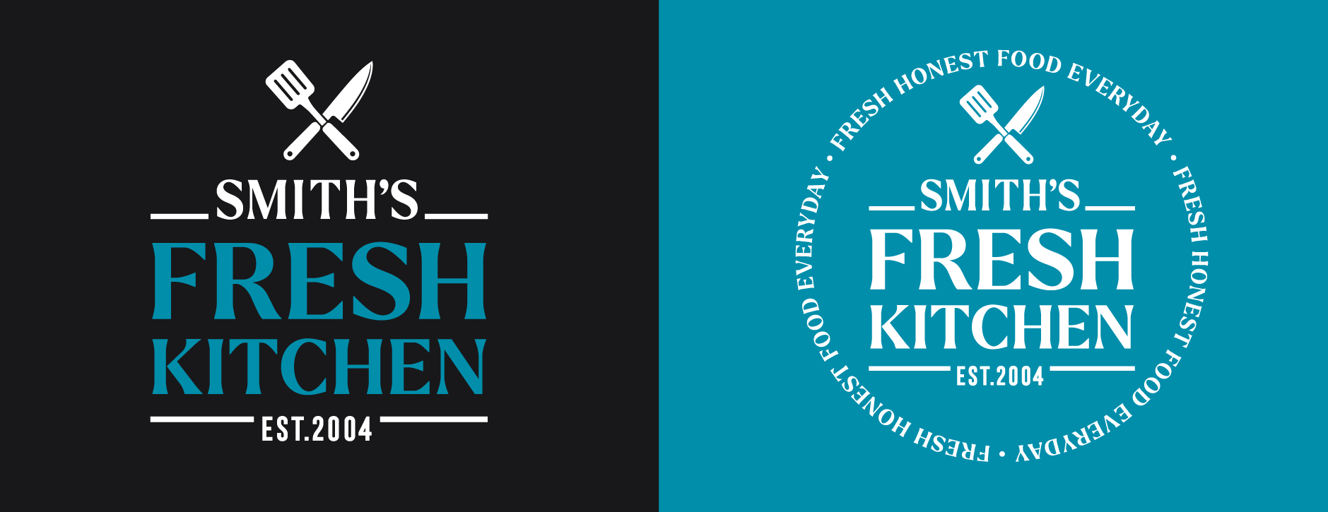
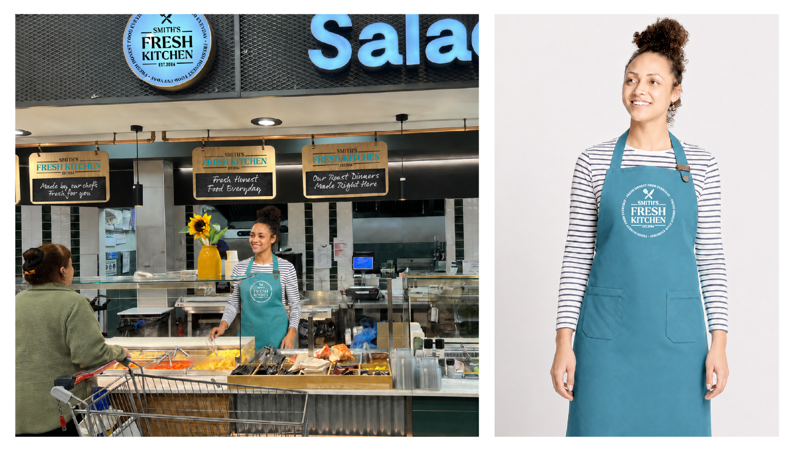
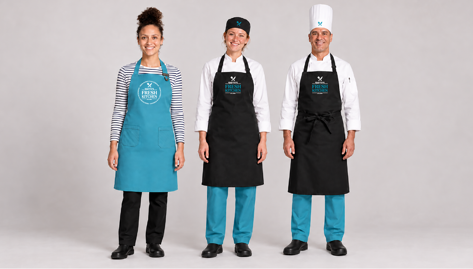
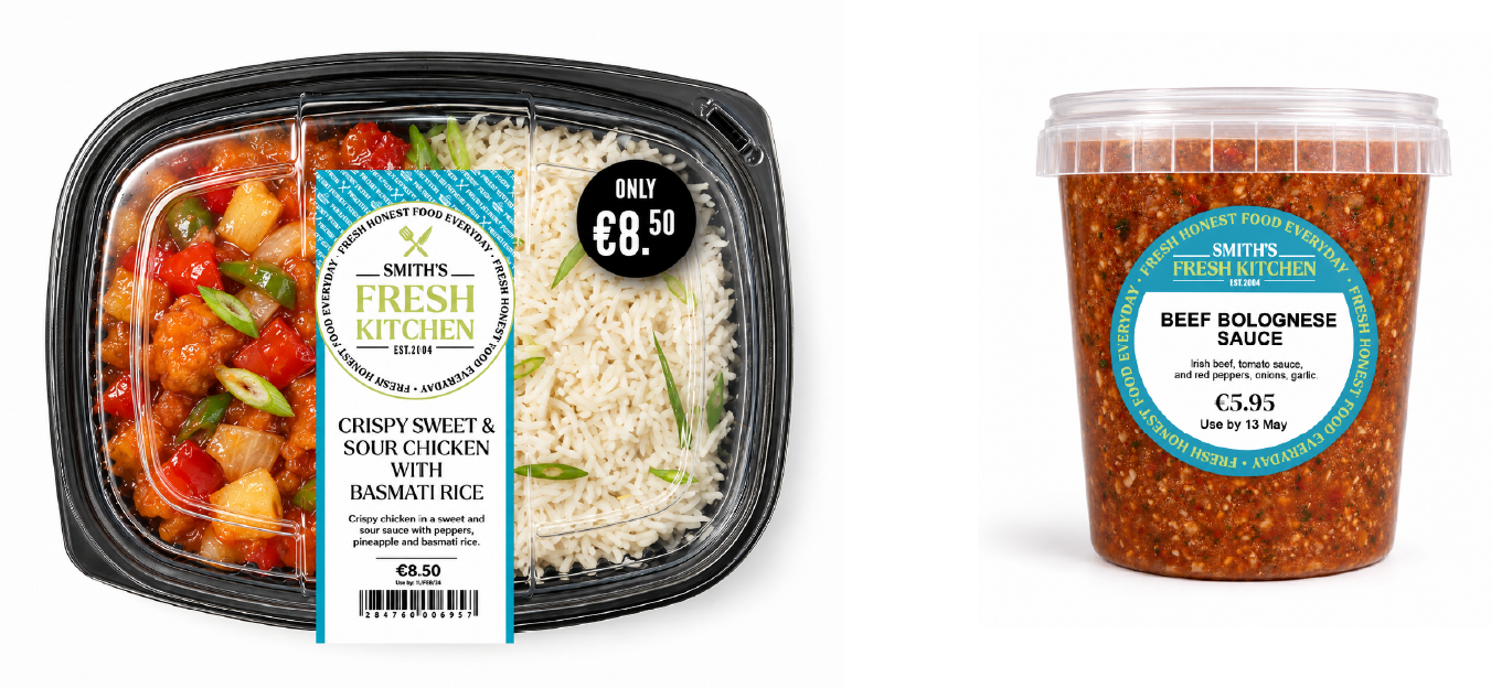
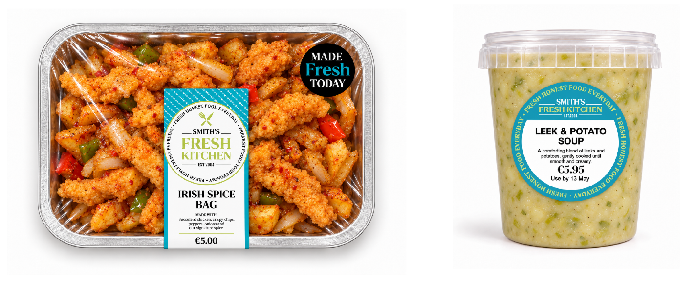
Fresh Kitchen puts the people preparing Smith’s food at the heart of the department. The identity brings a welcoming, contemporary feel to the hot counter, giving freshly cooked food a stronger presence in-store.
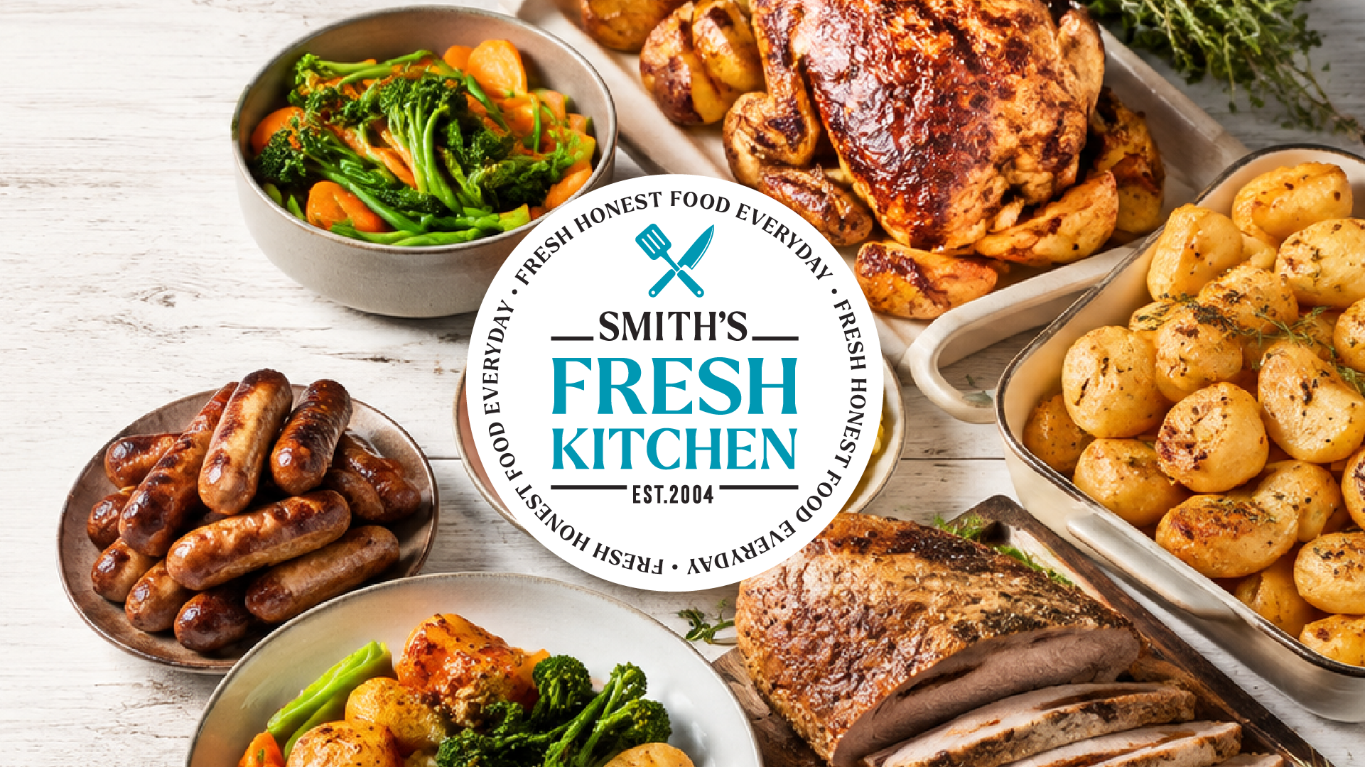
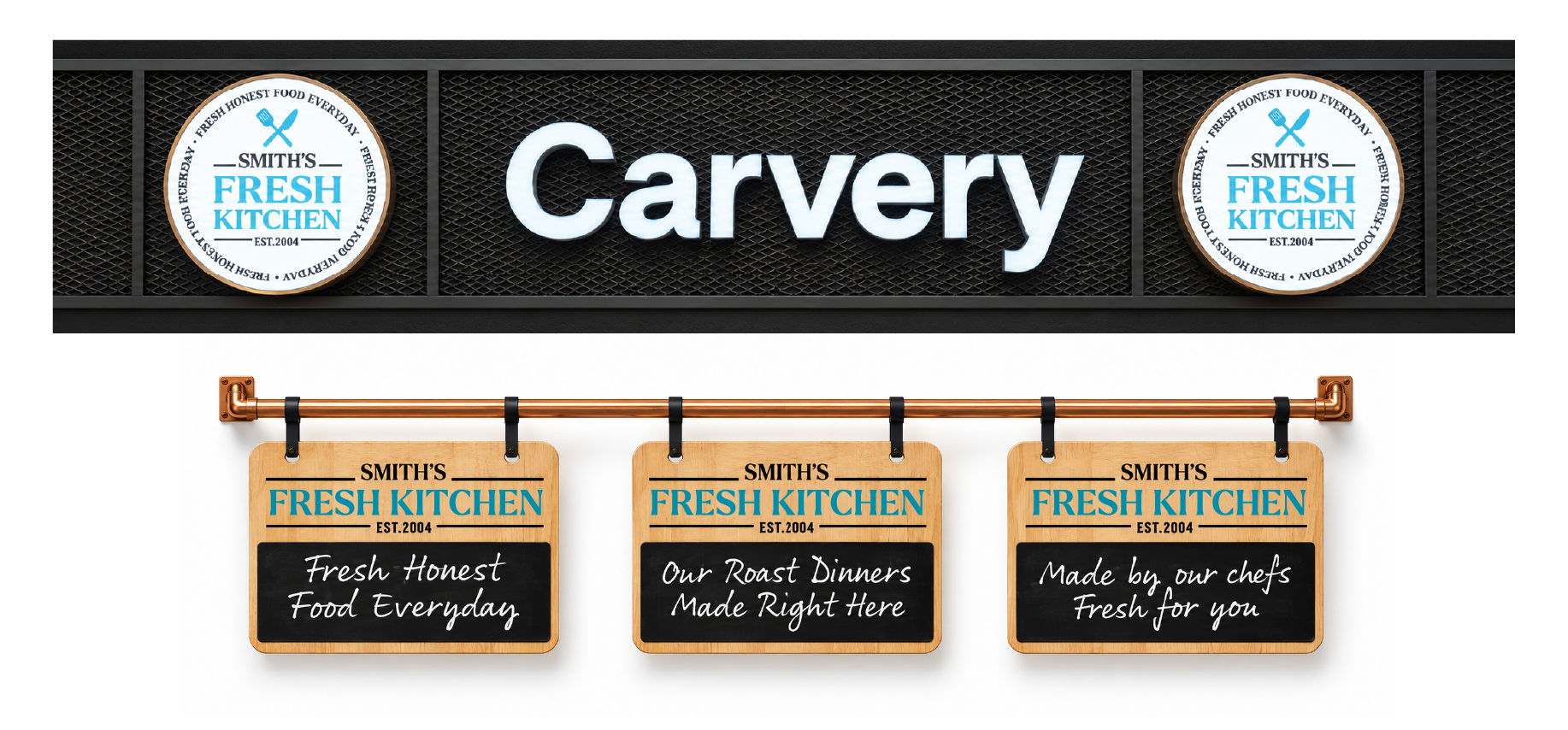
From counter signage and menu communication to packaging and staff uniforms, we developed a coordinated look that connects the team, the food and the service. It gives the department its own character while keeping it firmly part of Smith’s.
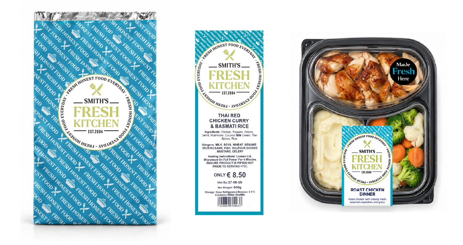
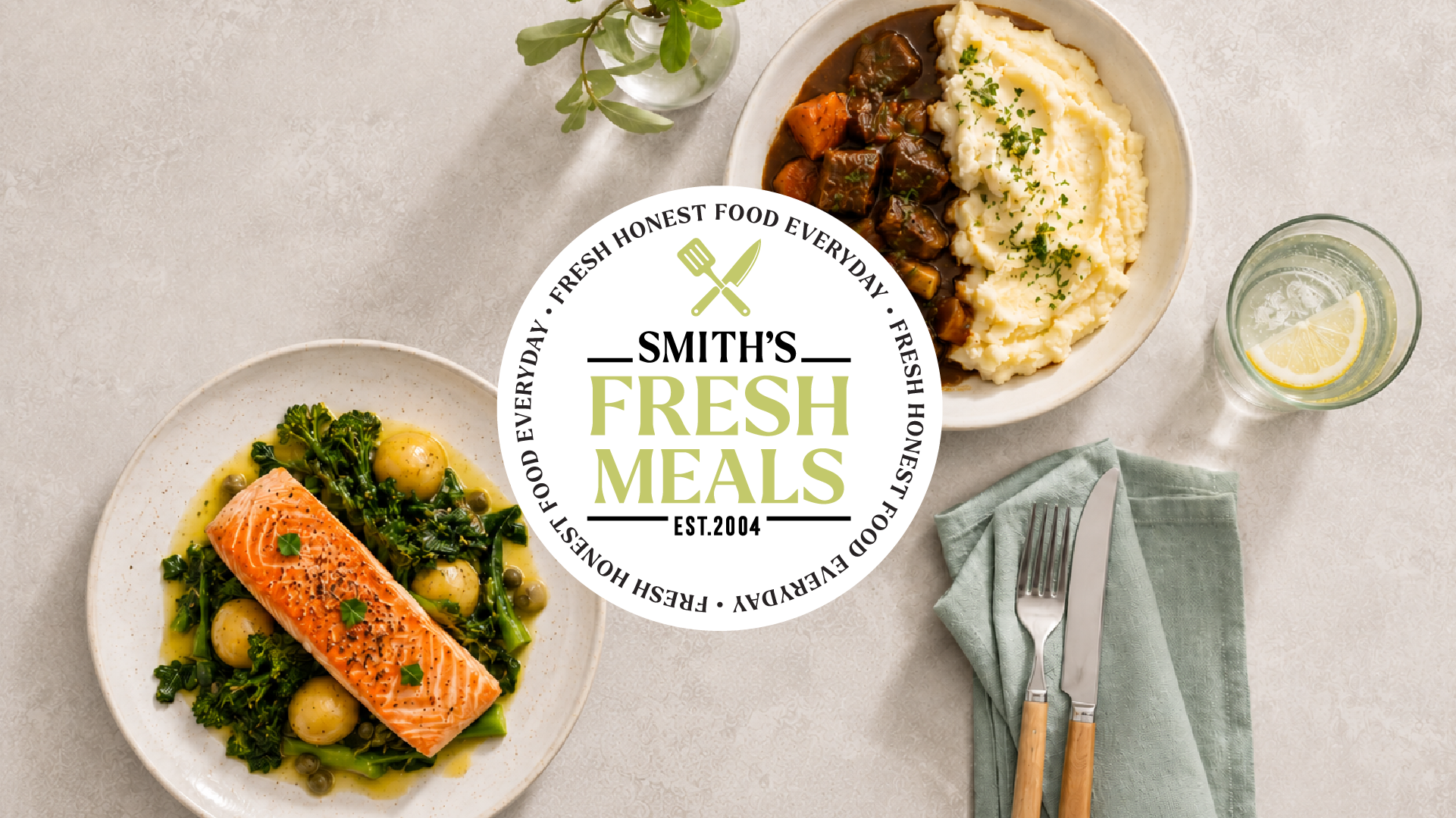
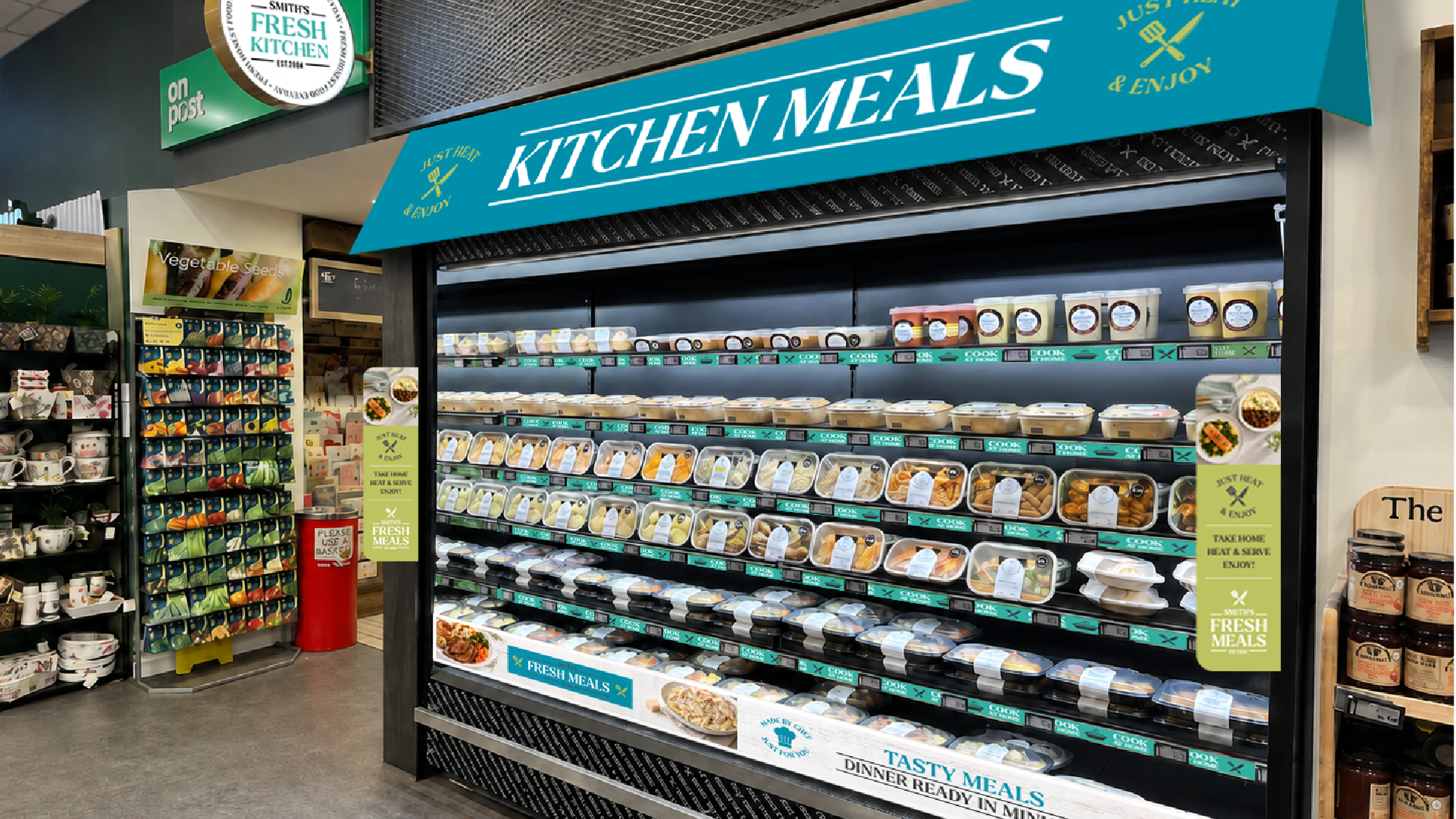
Cooked by Smith’s, ready for home. The Kitchen Ready Meals range brings the store’s food expertise into everyday mealtimes, with a dedicated identity for prepared dishes customers can take home and heat.
We brought packaging, labels, food imagery and fridge communication together to make the range easier to recognise and browse. A consistent design across individual meals and sharing formats gives the offer a clear Smith’s identity, from the chilled display to the kitchen table.


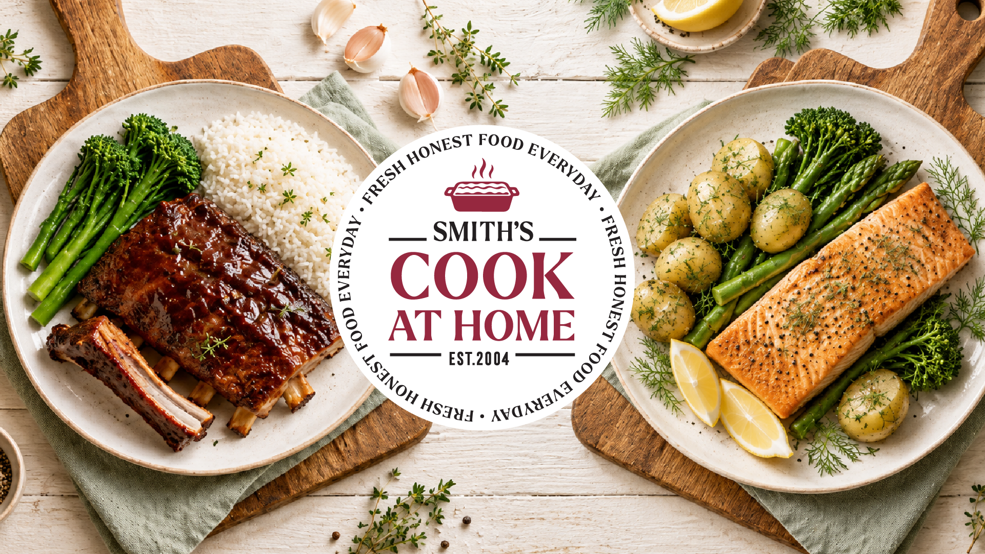
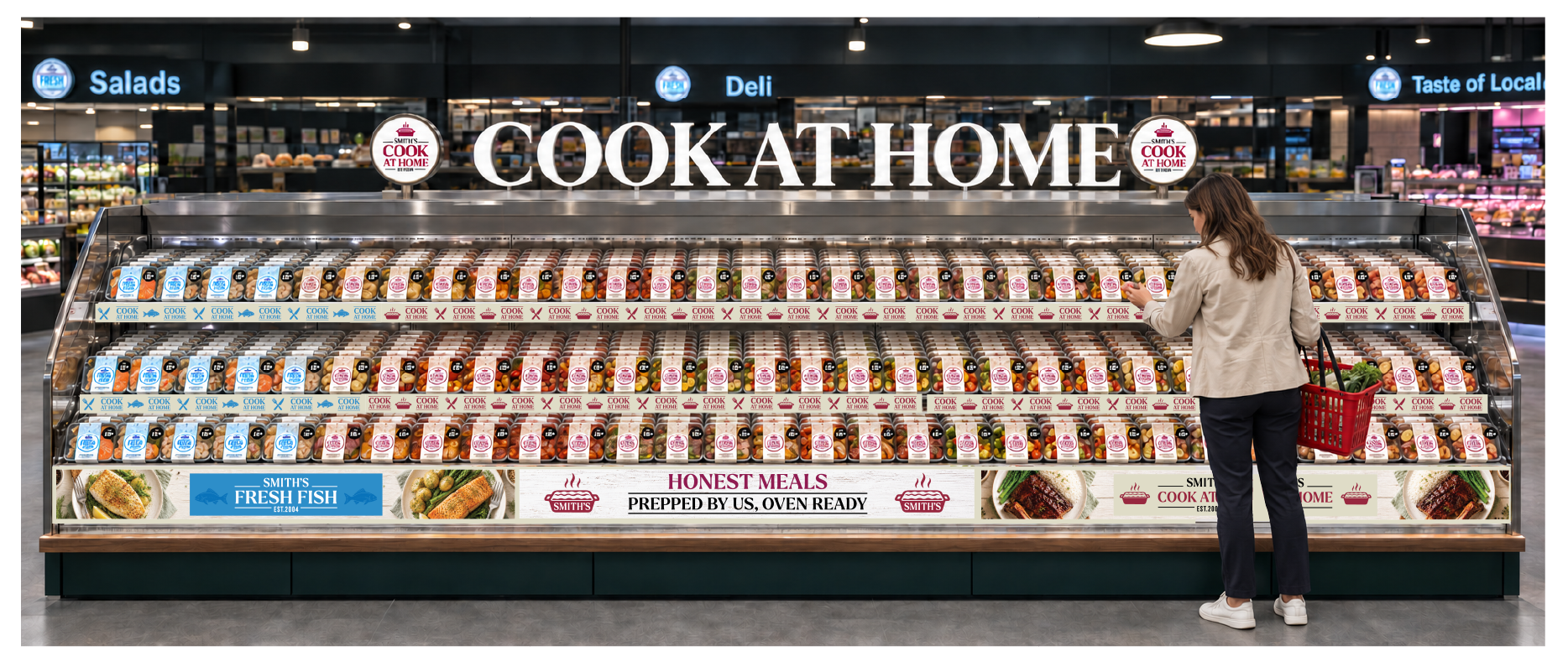
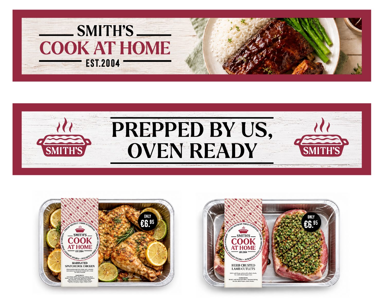
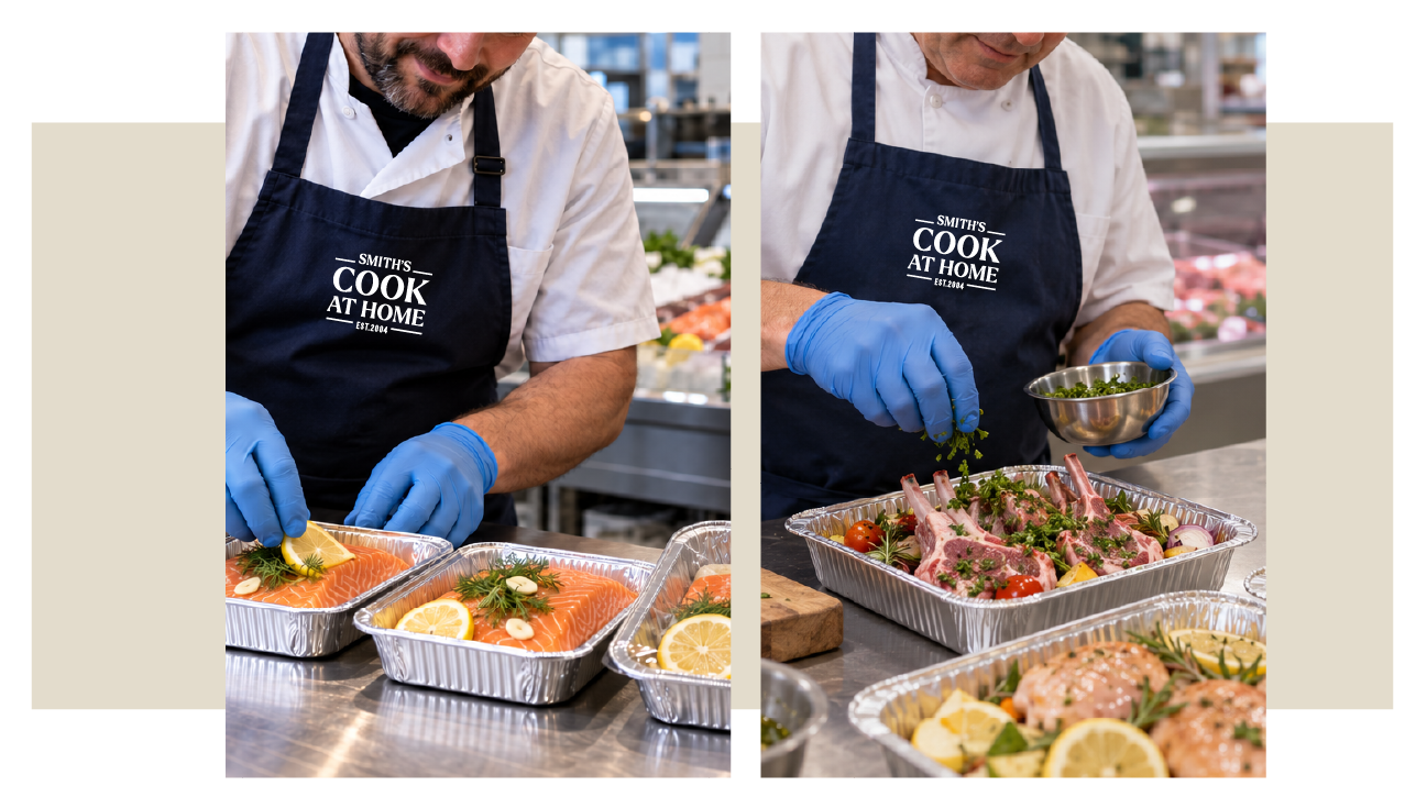
Prepared by Smith’s butchers and fishmongers, finished in your kitchen. Cook At Home gives fresh meat and fish dishes a dedicated identity, making the skill behind their preparation part of the story.
The green branding connects meal trays, sleeves, labels and in-store displays, helping customers distinguish the raw, ready-to-cook range from chef-cooked ready meals. It brings two specialist departments together around one simple idea: making good food easier to cook at home.
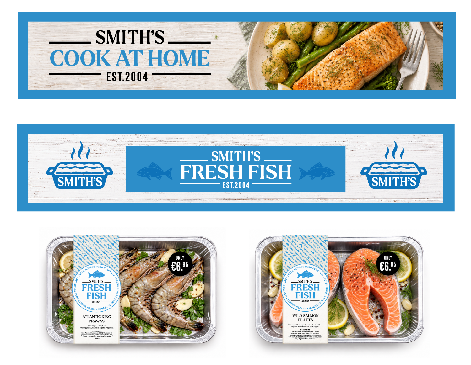

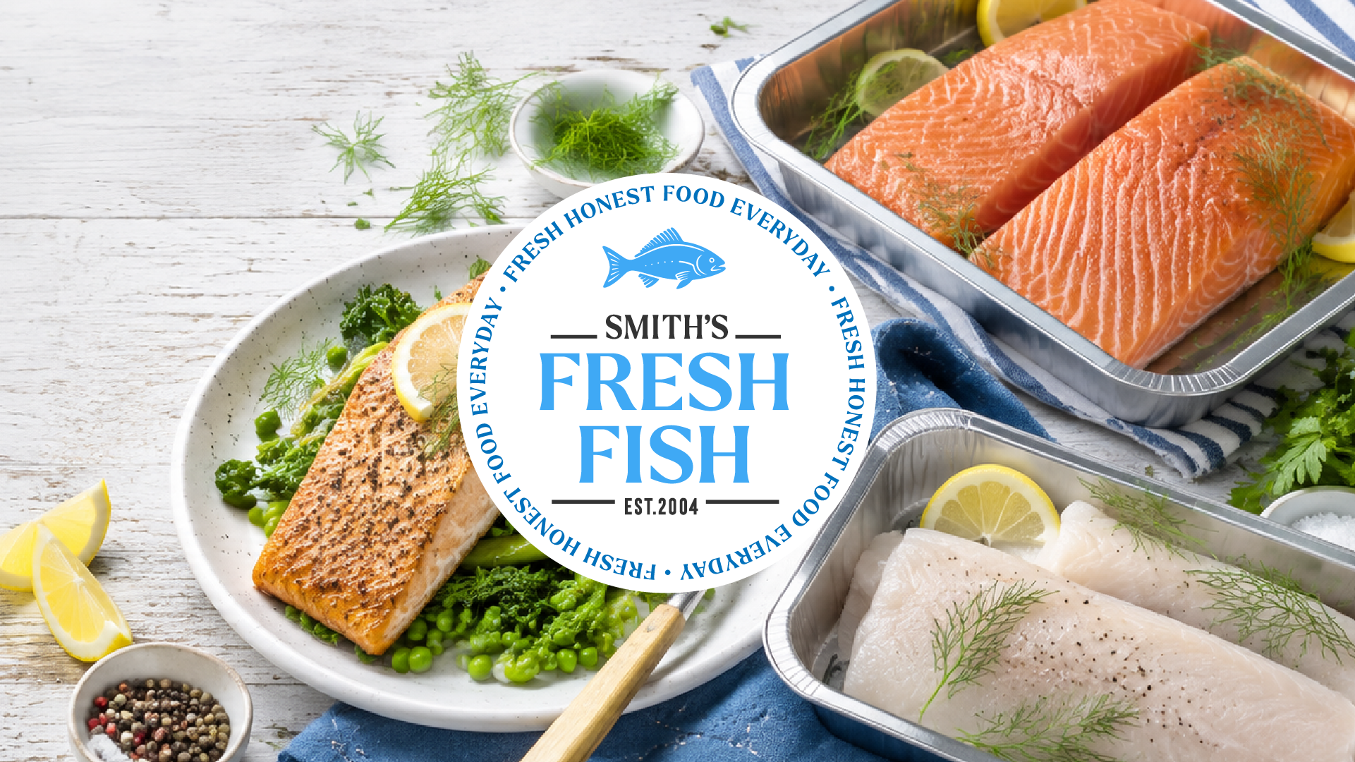
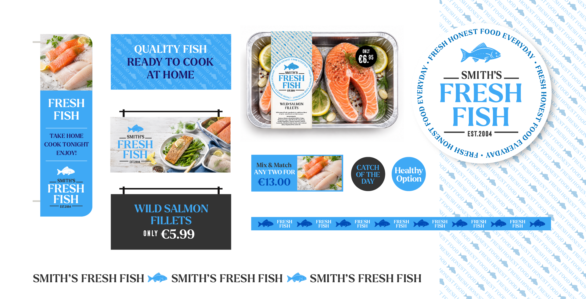
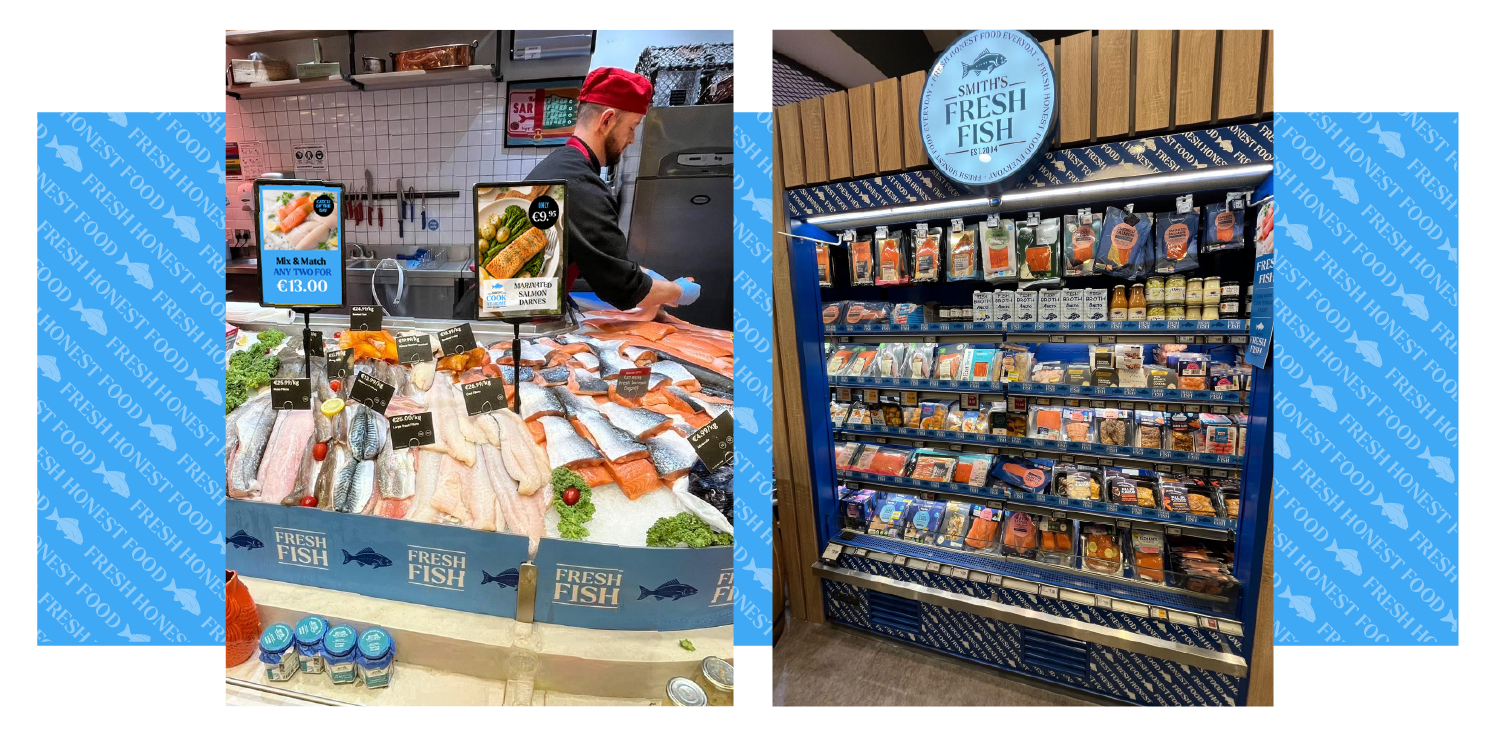
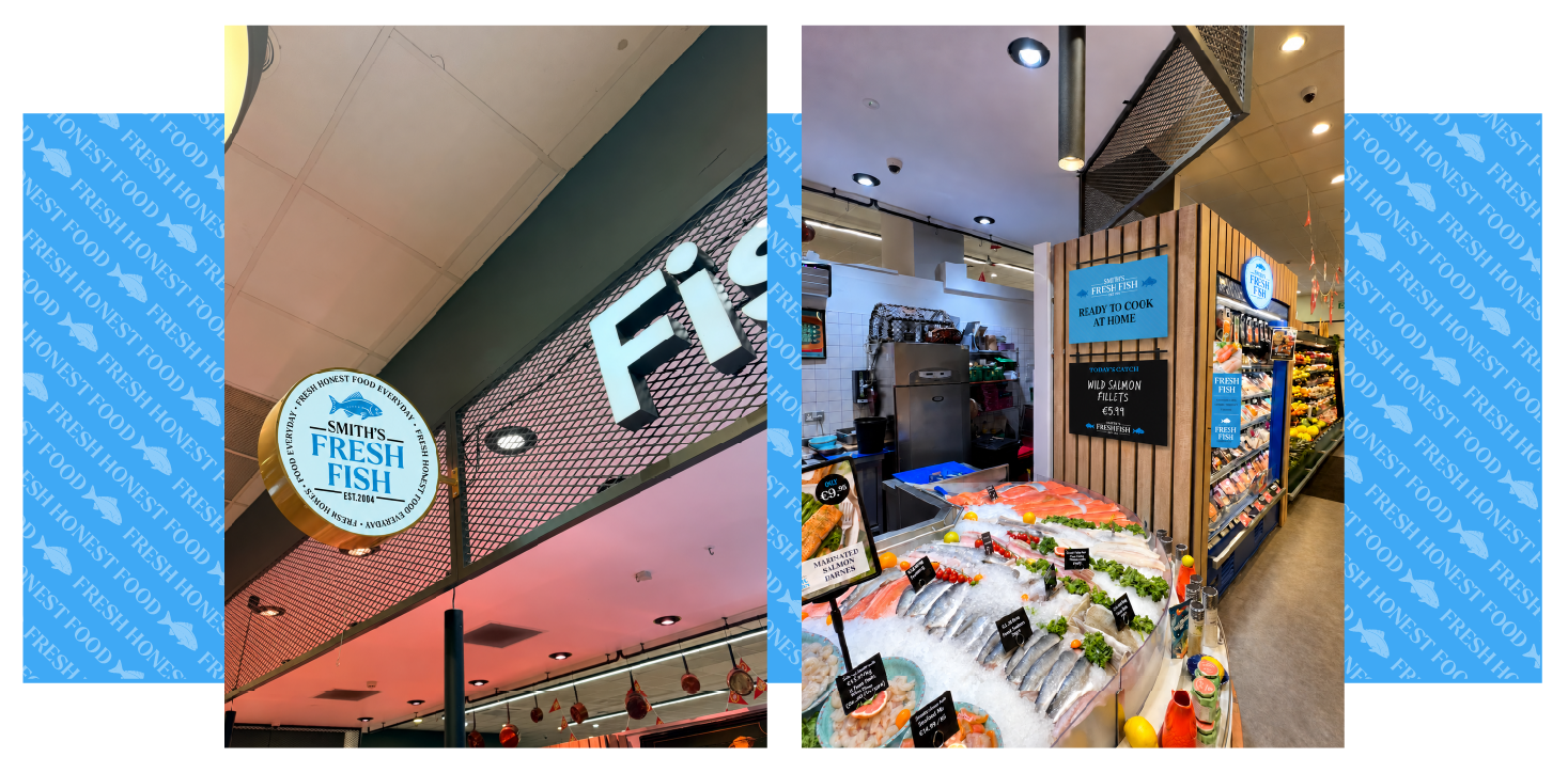
Smith’s Fresh Fish brings the character of a specialist fishmonger into the wider Food Market. The department identity gives the counter a clear presence and puts the fresh fish offer in focus.
The branding carries across the illuminated roundel, counter graphics and overhead banners, helping customers recognise the department from across the store. Consistent typography and signage connect it with the wider Smith’s identity while giving Fresh Fish its own distinct character.