LMPP Studio is a retail branding and packaging design studio based in London and Dublin specialising in supermarket, convenience and food-to-go brands.
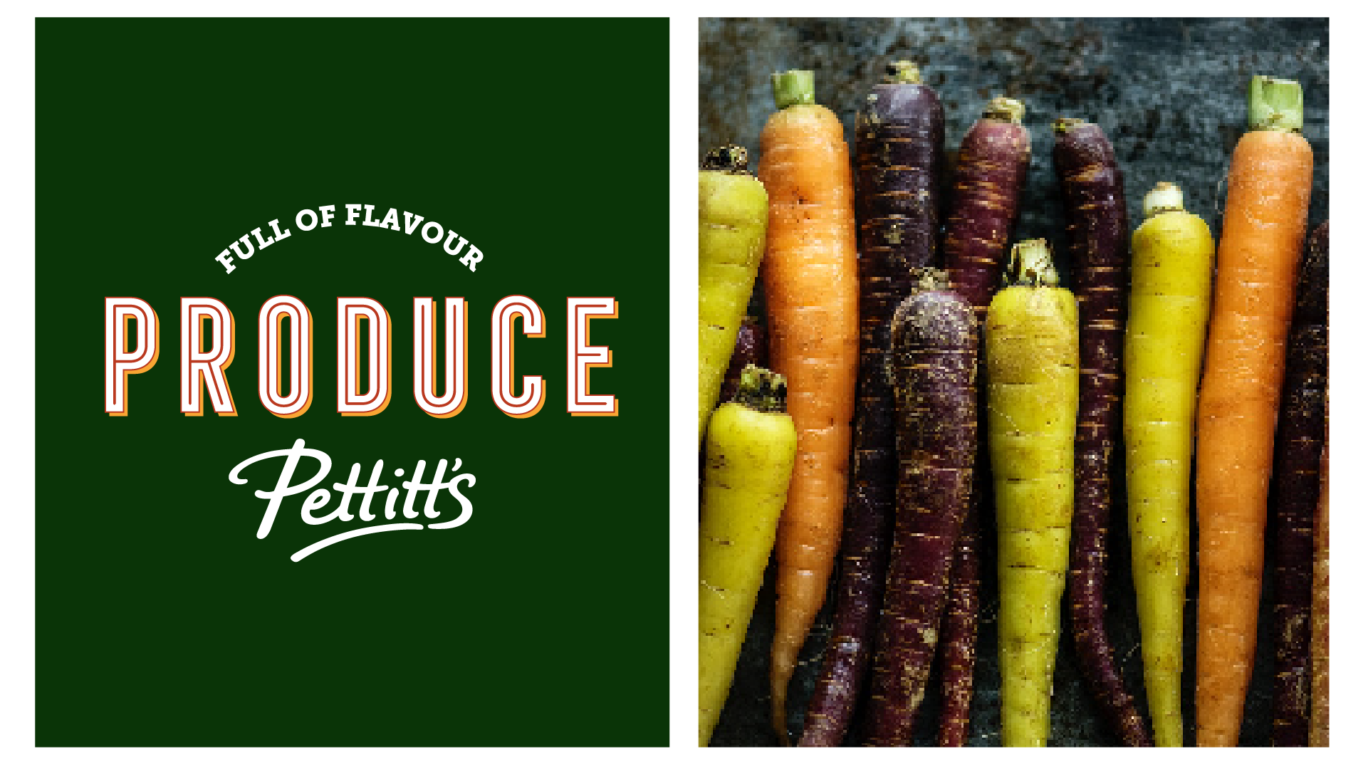
For Pettitt’s SuperValu, we delivered a comprehensive supermarket branding programme spanning visual identity, in-store communication, illustration and food-to-go packaging. This case study shows how retail-first brand strategy and design can strengthen customer loyalty, improve in-store navigation and create a distinctive supermarket experience rooted in community and quality.
🏆 OVERALL WINNER: SuperValu National Store of the Year 2025
Client
Pettitt’s SuperValu – independent supermarket retailer
Project Type
Supermarket branding, visual identity, in-store communication & packaging
Retail Environment
Supermarket retail, fresh food counters, food-to-go
Studio
LMPP Studio (London & Dublin)
Retail Brand Transformation

Project Overview
Pettitt’s SuperValu is a long-established, independent supermarket with a strong reputation for quality fresh food, local sourcing and customer service.
LMPP Studio partnered with Pettitt’s SuperValu to develop a cohesive supermarket brand system that would unify the in-store experience across fresh food counters, food-to-go, signage and packaging. The goal was to strengthen brand recognition, improve clarity in-store and create a more engaging, modern retail environment while retaining the store’s trusted, community-led character.
The Challenge
Pettitt’s SuperValu needed a brand system that could:
Work consistently across a busy supermarket retail environment
Improve navigation and clarity across multiple departments
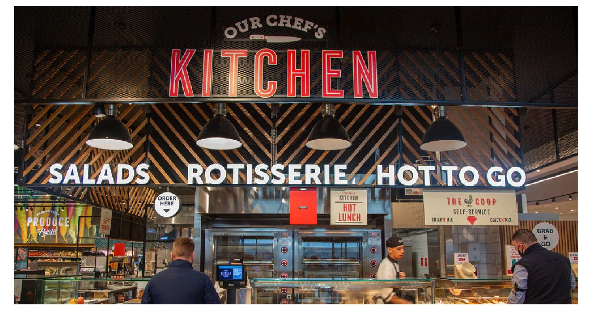
Elevate food-to-go and fresh food areas without losing authenticity
Balance SuperValu brand requirements with a strong independent identity
Scale across future campaigns, packaging and in-store communications
The challenge was to create a system that felt designed, not generic — and that supported both everyday shopping and premium fresh food experiences.
Our Approach
LMPP Studio took a retail-first branding approach, designing from the shop floor outwards.
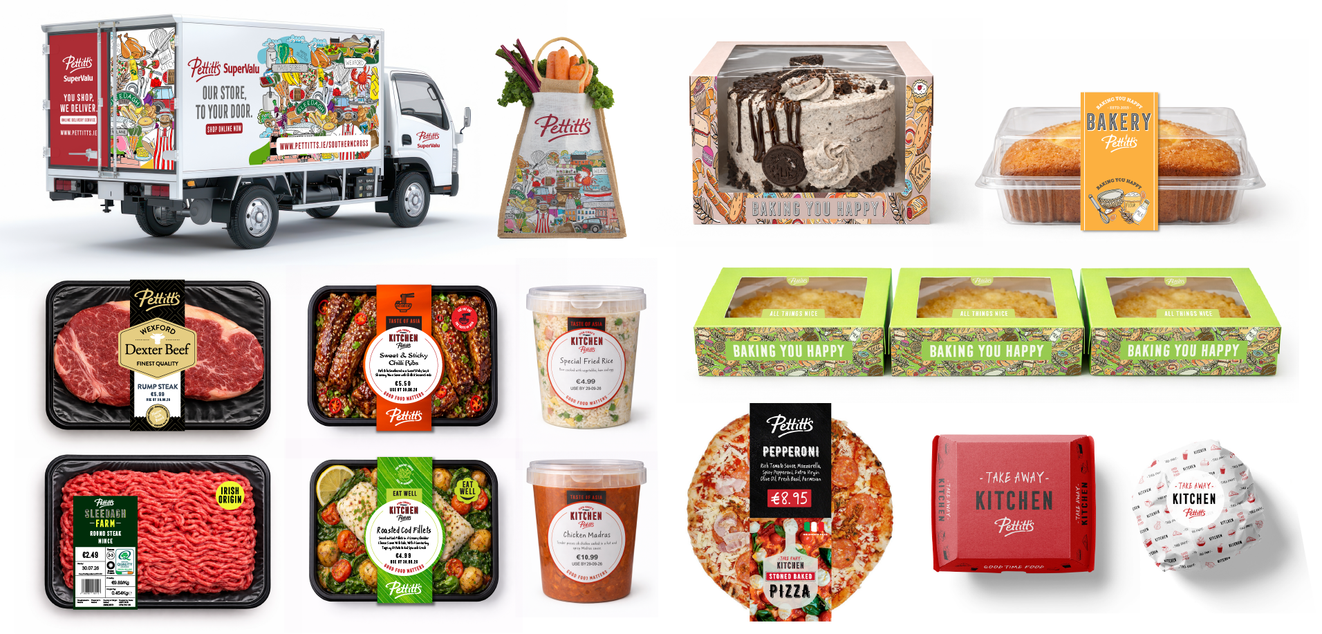
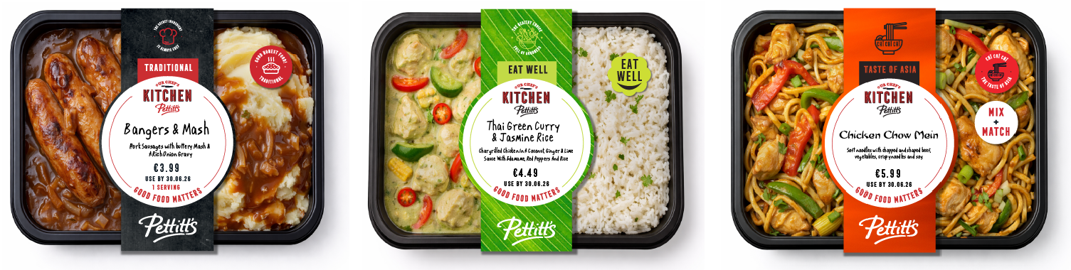
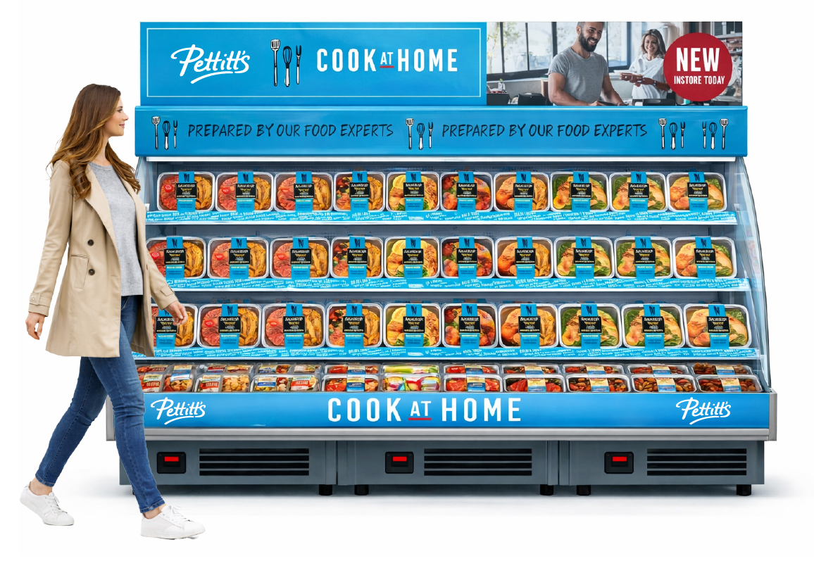
We developed a flexible visual identity and illustration system that could be applied across signage, packaging, POS and environmental graphics, ensuring clarity, warmth and consistency throughout the store.
Key elements of the approach included:
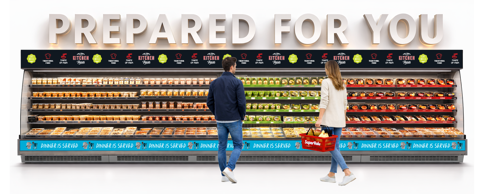
Clear visual hierarchy for fast in-store decision-making
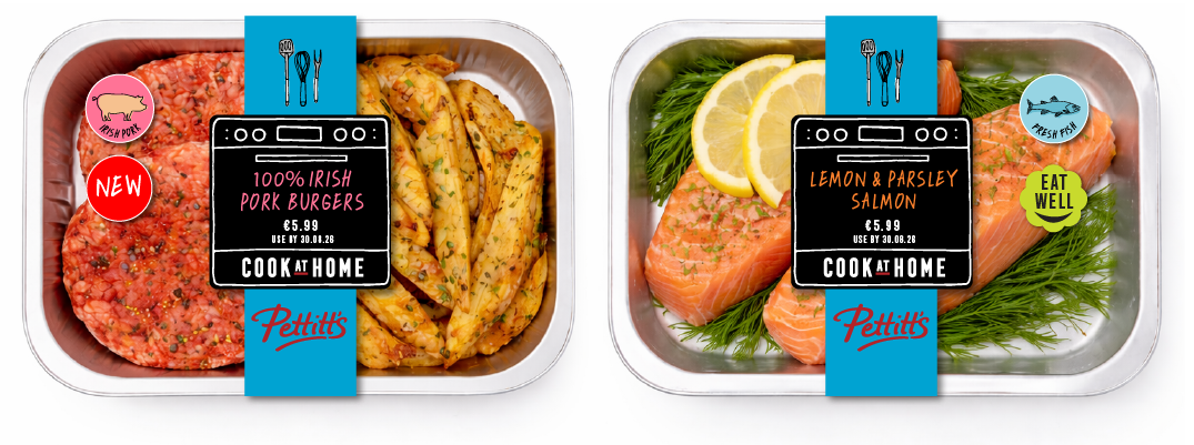
Illustration-led storytelling to highlight freshness, craft and provenance
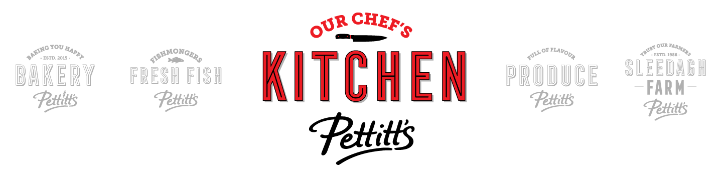
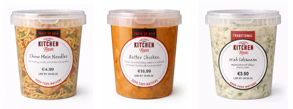
Distinct visual cues for departments and food-to-go areas
A system designed to evolve seasonally and campaign-led
Every design decision was made with the real supermarket environment in mind — how customers move, browse and buy.

In 1946 Jackie Pettitt opened his first food shop on the Main street in Wexford town.
The Results
The new branding created a more confident, recognisable and enjoyable supermarket experience for customers.
Improved clarity and navigation across the store
Stronger visual identity across fresh food and food-to-go
A warmer, more distinctive in-store atmosphere
A scalable system supporting future promotions and roll-outs
The result is a supermarket brand that feels modern and cohesive while remaining rooted in quality, trust and community.
Our Services
Supermarket Retail Brand Strategy
Visual Identity Design
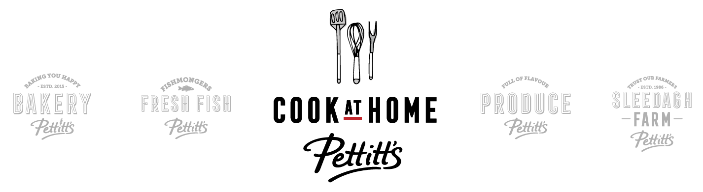
Illustration & Iconography
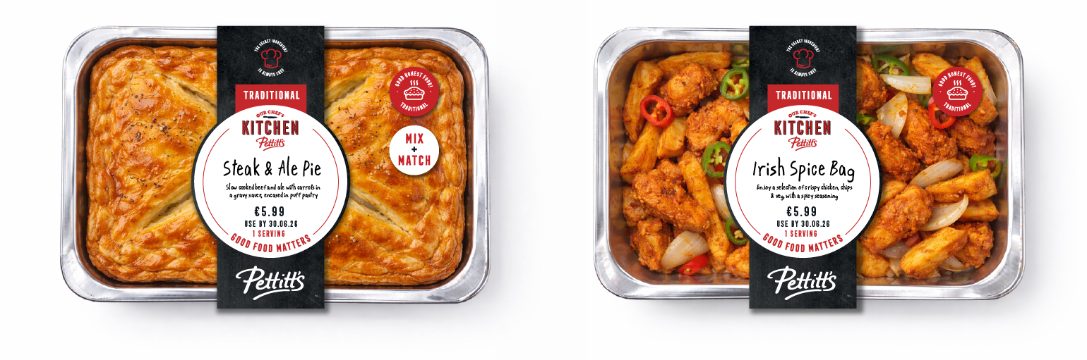
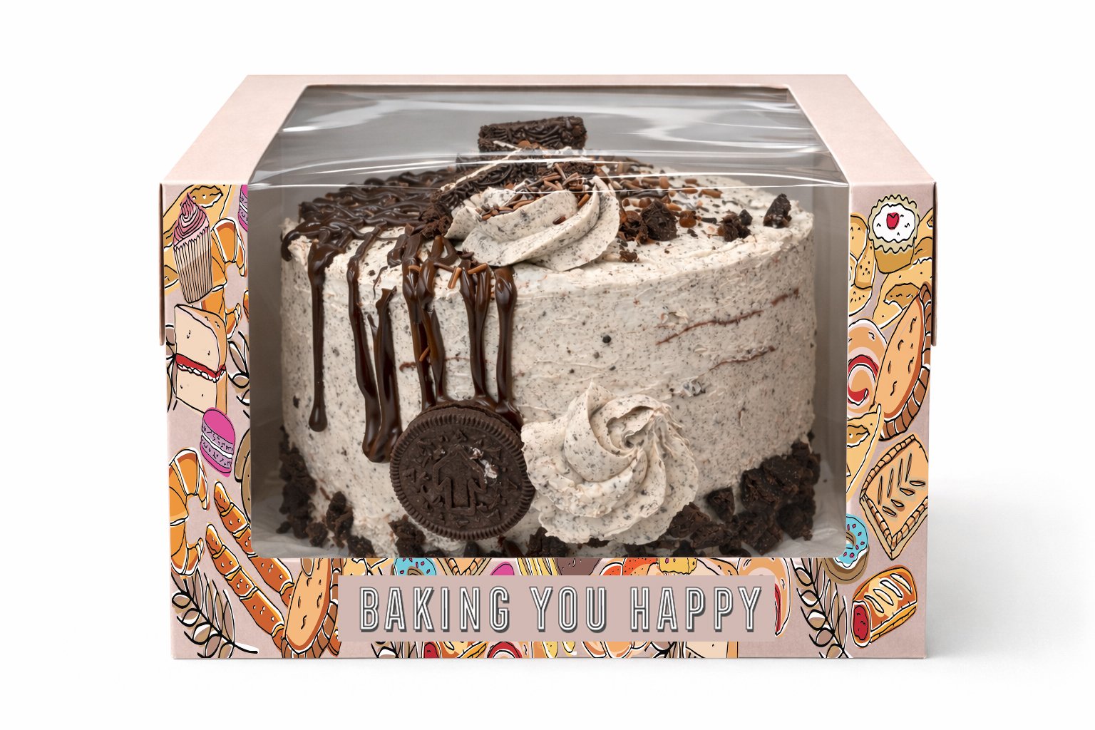
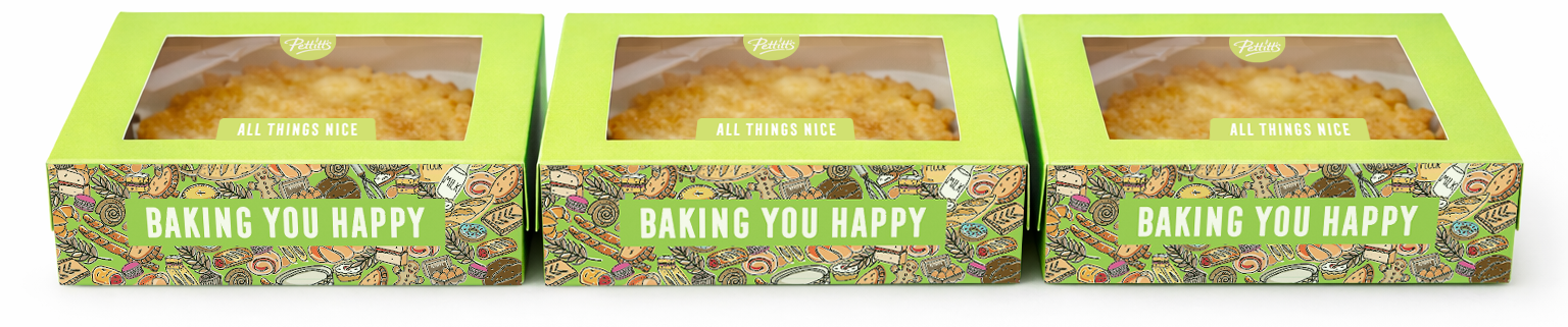
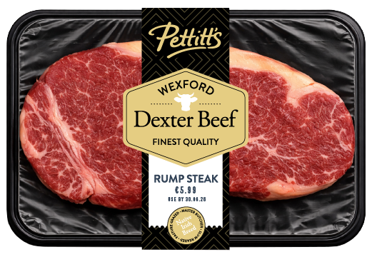
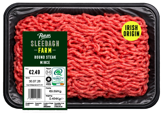
Food-to-Go Packaging Design
In-Store Communication & POS
Campaign & Retail Roll-Out Support

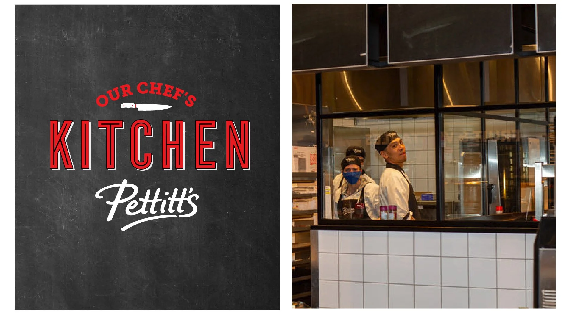
Pettitt’s Flagship Store Bray – Master Illustration

Bakery & Deli Illustrations


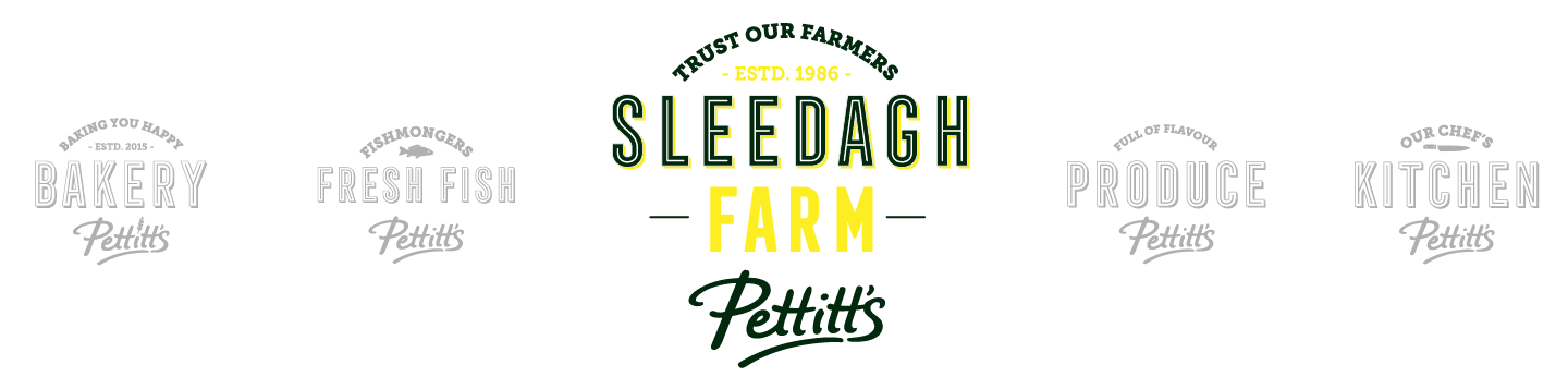
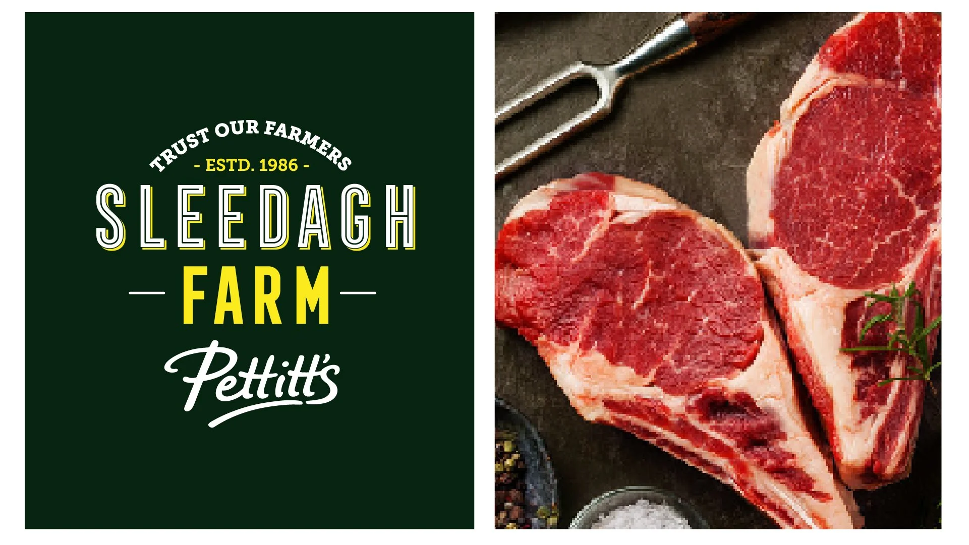
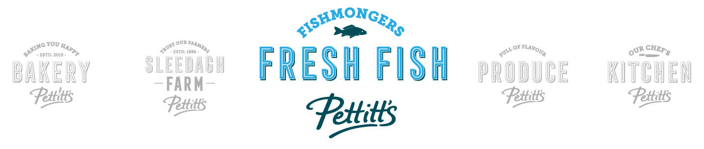
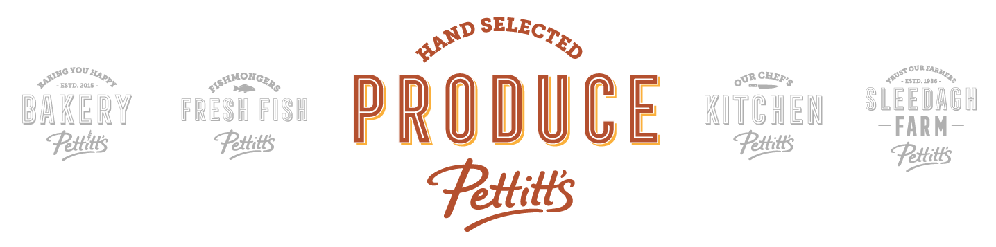
Pettitt’s Departmental Logos


LMPP Studio specialises in retail branding and packaging design for supermarket, convenience and food-to-go brands across the UK and Ireland.