Logo Design by LMPP
Logo Design & Identity Systems
Distinctive marks. Built for business. Ready to scale.
LMPP Studio designs logos and identity systems that work everywhere your brand lives—on pack, in‑store, online, and out front. We offer two clear routes depending on where you’re starting:
Identity Creation — for new brands or new ventures.
Identity Rebrand — for evolving an existing mark without losing equity.
Services
Visual Identity | Strapline Creation | Brand Colour Palette | Brand Typeface | Logo Suite
Identity Creation
We define the brand and design a standout mark with a scalable system—so you launch with confidence and look consistent from day one.
What We Do
Positioning snapshot and tone of voice cues
Creative territories and moodboards
3 logo directions with rationale and on‑pack/in‑store mockups
Primary mark, secondary lockups, small‑space icon, wordmark
Colour palette and typography system
Supporting assets: patterns, icons, illustration style
Brand usage guidelines (practical, retail‑focused)
Outcomes
A memorable, ownable logo that reads at shelf distance
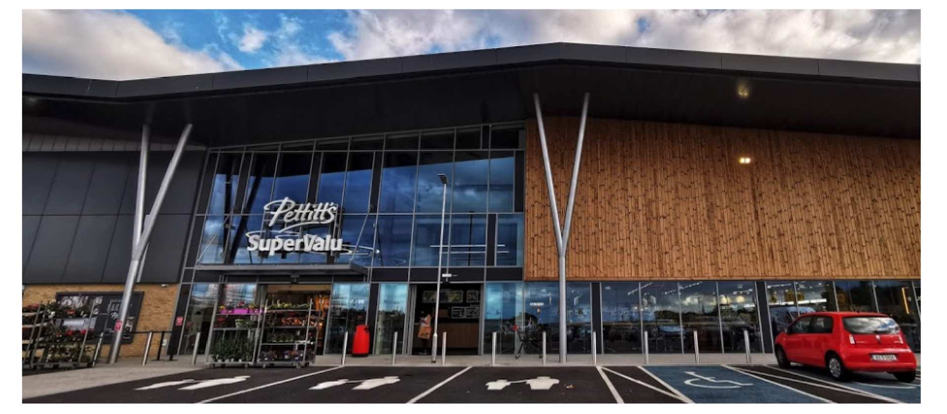
A complete identity system ready for packaging, POS and signage

Identity Rebrand
We retain what your customers know and love, then refine for clarity, impact and modern usage—across pack, store and digital.
What We Do
Equity audit: what to keep, evolve, or retire
Redrawing/optical kerning and spacing for legibility
Simplified shapes for small sizes and signage
Colour rationalisation and accessibility checks
Consistent lockups and hierarchy (primary/secondary/sub‑marks)
Application mockups (pack, POS,
storefront, social)
Updated usage guidelines and
export kit
Outcomes
A sharper, more consistent logo without
losing recognition
Better readability at small sizes and on challenging substrates
Faster, cleaner rollout across packaging
and in‑store assets